-
【机器学习&数据挖掘】基于自回归积分滑动平均模型的疫情分析报告 附完整python代码
资源地址:Python数据分析大作业 2000+字 图文分析文档 疫情分析+完整python代码

数据分析


数据预处理

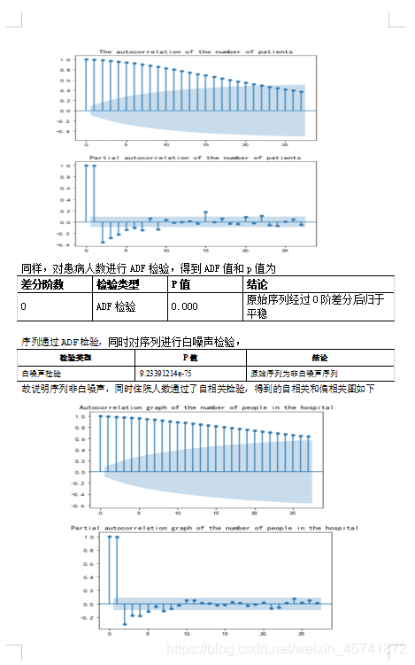
建立模型
模型预测


资源地址:Python数据分析大作业 2000+字 图文分析文档 疫情分析+完整python代码
代码详解


主要是对时间序列数据进行分析和预测。让我们逐步解释每一部分:
-
导入必要的库:
from math import * import numpy as np import pandas as pd import matplotlib.pyplot as plt from statsmodels.graphics.tsaplots import plot_acf, plot_pacf from pylab import *math: 导入数学函数库,但实际上在后续的代码中没有用到。numpy、pandas、matplotlib.pyplot: 分别是用于数值计算、数据处理和可视化的常用库。statsmodels.graphics.tsaplots.plot_acf和statsmodels.graphics.tsaplots.plot_pacf:用于绘制自相关性和偏自相关性图。pylab: 导入了*,所以其下所有函数都可直接使用。
-
设置中文字体和负号显示:
plt.rcParams['font.sans-serif'] = ['SimHei'] # 设置中文字体为黑体 plt.rcParams['axes.unicode_minus'] = False # 解决负号显示问题 -
读取数据:
cas_confirmes = pd.read_csv('cas_confirmes.csv', index_col=0)
hospitalises = pd.read_csv('hospitalises.csv', index_col=0)
从文件中读取了两个时间序列数据,分别是患病确诊人数和住院人数。
-
数据处理:
cas_confirmes.fillna(np.nanmean(cas_confirmes) + 30 * np.random.random(), inplace=True)
hospitalises.fillna(np.nanmean(hospitalises), inplace=True)
使用每列的均值填充缺失值。
-
数据可视化:
cas_confirmes.plot()
plt.title('Change in the number of cases')
plt.show()
hospitalises.plot()
plt.title('Changes in the number of people in the hospital')
plt.show()
绘制了患病确诊人数和住院人数的变化趋势图。
-
自相关性分析:
plot_acf(cas_confirmes)
plt.title('The autocorrelation of the number of patients')
plot_pacf(cas_confirmes)
plt.title('Partial autocorrelation of the number of patients')
plt.show()

plot_acf(hospitalises)
plt.title('Autocorrelation graph of the number of people in the hospital')
plot_pacf(hospitalises)
plt.title('Partial autocorrelation graph of the number of people in the hospital')
plt.show()
绘制了患病确诊人数和住院人数的自相关性和偏自相关性图。
-
ARIMA 模型定阶:
train_results = sm.tsa.arma_order_select_ic(cas_confirmes['2020-03-19':'2021-06-09'], ic=['bic'], trend='nc', max_ar=5, max_ma=5)
print('BIC for the number of patients', train_results.bic_min_order)
使用 BIC 准则确定 ARIMA 模型的阶数。
-
构建 ARIMA 模型:
model = ARIMA(cas_confirmes['2020-03-19':'2021-05-09'], order=(2,0,1))
results_comfirm = model.fit();
使用确定的阶数构建 ARIMA 模型,并对患病确诊人数和住院人数分别进行建模。
-
模型诊断:
print('The white noise test result of the diseased difference sequence was:', acorr_ljungbox(resid1.values.squeeze(), lags=1))
print('The white noise test result of hospitalization difference sequence is:', acorr_ljungbox(resid2.values.squeeze(), lags=1))
对模型的残差进行自相关性分析,检验残差序列是否为白噪声。
-
模型预测:
predict_comfirm=results_comfirm.forecast(30)使用训练好的 ARIMA 模型对未来一段时间内的患病确诊人数和住院人数进行预测。
-
可视化预测结果:
plt.plot(list(range(1,418)),predict_sunspots_comfirm,label='predict comfirmed')
plt.plot(smooth_comfirm.loc['2020-03-18':'2021-06-09'],label='true comfirmed')
plt.plot(list(range(417,447)),predict_comfirm[0],'g',label='future predict')
plt.title('Actual and predicted disease graphs')
plt.legend()
绘制预测结果和真实数据的对比图。
-
-
相关阅读:
前端基础之《Bootstrap(4)—全局CSS样式_图片、辅助类、响应式工具》
查看数据库中全部的表
PDF文件的页眉页脚无法删除的原因和三种替代方法
开发语言漫谈-React
树与堆(详解)
AM5-DB低压备自投装置在河北冠益荣信科技公司洞庭变电站工程中的应用
consul部署
Explain
阿里三面:MQ 消息丢失、重复、积压问题,如何解决?
顶级“Redis学习笔记”,缓存雪崩+击穿+穿透+集群+分布式锁,NB了
- 原文地址:https://blog.csdn.net/weixin_45741872/article/details/139434341