-
【深耕 Python】Data Science with Python 数据科学(7)书352页练习题
写在前面
关于数据科学环境的建立,可以参考我的博客:
【深耕 Python】Data Science with Python 数据科学(1)环境搭建
往期数据科学博文:
【深耕 Python】Data Science with Python 数据科学(2)jupyter-lab和numpy数组
【深耕 Python】Data Science with Python 数据科学(3)Numpy 常量、函数和线性空间
【深耕 Python】Data Science with Python 数据科学(4)(书337页)练习题及解答
【深耕 Python】Data Science with Python 数据科学(5)Matplotlib可视化(1)
【深耕 Python】Data Science with Python 数据科学(6)Matplotlib可视化(2)
代码说明: 由于实机运行的原因,可能省略了某些导入(import)语句。
Question 1
Add a title and axis labels to the plot shown in Figure 11.15.
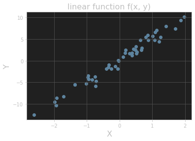
# ex 1 import matplotlib.pyplot as plt y = 5 * x + rng.standard_normal(n_pts) fig, ax = plt.subplots() ax.scatter(x, y) plt.title("linear function f(x, y)", fontsize=16) plt.xlabel("X", fontsize=16) plt.ylabel("Y", fontsize=16) plt.grid() plt.show()- 1
- 2
- 3
- 4
- 5
- 6
- 7
- 8
- 9
- 10
输出的图像:
Question 2
Add titles to the histograms in Section 11.3.3.
Answer 1
# ex 2 values = rng.standard_normal(1000) fig, ax = plt.subplots() ax.hist(values) plt.title("histogram_1") plt.grid() plt.show()- 1
- 2
- 3
- 4
- 5
- 6
- 7
输出的图像:

Answer 2
fig, ax = plt.subplots() ax.hist(values, bins=20) plt.title("histogram_2") plt.grid() plt.show()- 1
- 2
- 3
- 4
- 5
输出的图像:

Question 3
One common plotting task is including multiple subplots in the same figure. Show that the code in Listing 11.10 creates vertically stacked subplots, as shown in Figure 11.18. (Here the suptitle() method produces a “supertitle” that sits above both plots. See the Matplotlib documentation on subplots for other ways to create multiple subplots.)
# ex 3 import numpy as np from math import tau x = np.linspace(0, tau, 100) fig, (ax1, ax2) = plt.subplots(2) fig.suptitle(r"Vertically stacked plots of $\cos(\theta)$ and $\sin(\theta)$.") ax1.grid() ax1.plot(x, np.cos(x)) ax2.grid() ax2.plot(x, np.sin(x))- 1
- 2
- 3
- 4
- 5
- 6
- 7
- 8
- 9
- 10
输出的图像:

Question 4
Add a plot of the function cos(x - t/8) to the plot in Figure 11.14 with color “orange” and linestyle “dashdot”. Extra credit: Add an annotation as well. (The extra-credit step is much easier in an interactive Jupyter notebook, especially when finding the right coordinates for the annotation label and arrow.)
#%% # ex 4 from math import tau import numpy as np import matplotlib.pyplot as plt x = np.linspace(0, tau, 100) fig, ax = plt.subplots() ax.set_xticks([0, tau / 4, tau / 2, 3 * tau / 4, tau]) ax.set_yticks([-1, -1 / 2, 0, 1 / 2, 1]) plt.grid() ax.set_xticklabels([r'$0$', r'$\tau/4$', r'$\tau/2$', r'$3\tau/4$', r'$\tau$']) ax.set_yticklabels([r'$-1$', r'$-1/2$', r'$0$', r'$1/2$', r'$1$']) ax.set_title("One period of cosine and sine", fontsize=16) ax.set_xlabel(r"$\theta$", fontsize=16) ax.set_ylabel(r"$f(\theta)$", fontsize=16) ax.annotate(r"$\cos(\theta)$", xy=(1.75, -0.3), xytext=(0.5, -0.75), arrowprops={"facecolor": "black", "width": 1}, fontsize=16) ax.annotate(r"$\sin(\theta)$", xy=(2.75, 0.5), xytext=(3.5, 0.75), arrowprops={"facecolor": "black", "width": 1}, fontsize=16) ax.annotate(r"$\cos(\theta - 2\pi / 8)$", xy=(1.83, 0.5), xytext=(1.0, 0.75), arrowprops={"facecolor": "black", "width": 1}, fontsize=16) fig.set_dpi(150) ax.plot(x, np.cos(x), color="red", linestyle="dashed") ax.plot(x, np.sin(x), color="blue", linestyle="dotted") ax.plot(x, np.cos(x - tau / 8), color="orange", linestyle="dashdot") plt.show()- 1
- 2
- 3
- 4
- 5
- 6
- 7
- 8
- 9
- 10
- 11
- 12
- 13
- 14
- 15
- 16
- 17
- 18
- 19
- 20
- 21
- 22
- 23
- 24
- 25
- 26
- 27
- 28
- 29
- 30
- 31
- 32
- 33
- 34
输出的图像:

参考文献 Reference
《Learn Enough Python to be Dangerous——Software Development, Flask Web Apps, and Beginning Data Science with Python》, Michael Hartl, Boston, Pearson, 2023.
-
相关阅读:
传统企业如何实现数字化转型?
北斗导航 | 最小二乘模糊度估计方法(LSAR:Least Squares Ambiguity Resolution)
视频去噪网络BSVD的实现
道可云元宇宙每日资讯|《江苏省元宇宙产业发展行动计划》发布
webSocket 有哪些安全问题?
顺序表-c语言实现
TCP三次握手
Vue:ElementUI练习(路由嵌套)路由嵌套 重定向(狂神)
React项目中webpack的配置过程
PyQt5 不规则窗口的显示
- 原文地址:https://blog.csdn.net/weixin_43031313/article/details/137267014
