-
display:table 和 grid
一、flex布局
1.1 flex介绍
display:flex 或 display:inline-flex 声明为弹性容器
flex-wrap换行
justify-content

align-items

align-content多行对齐

自我对齐 align-self (作用在子级元素

1.2 flex布局实战
实现盒子3等分

<template> <div class="father"> <div class="son1">Son111</div> <div class="son2">Son222</div> <div class="son3">Son333</div> </div> </template> <script setup></script> <style lang="scss" scoped> .father { display: flex; height: 200px; border: 1px solid red; .son1 { flex: 1; background-color: purple; } .son2 { flex: 1; background-color: green; } .son3 { flex: 1; background-color: skyblue; } } </style>- 1
- 2
- 3
- 4
- 5
- 6
- 7
- 8
- 9
- 10
- 11
- 12
- 13
- 14
- 15
- 16
- 17
- 18
- 19
- 20
- 21
- 22
- 23
- 24
- 25
- 26
- 27
- 28
- 29
- 30
实现盒子2等分
同上
3栏布局,中间自适应
<template> <div class="father"> <div class="son1">Son111</div> <div class="son2">Son222</div> <div class="son3">Son333</div> </div> </template> <script setup></script> <style lang="scss" scoped> .father { --son1-width: 50px; --son3-width: 150px; display: flex; height: 200px; border: 1px solid red; .son1 { width: var(--son1-width); background-color: purple; } .son2 { flex: 1; background-color: green; } .son3 { width: var(--son3-width); background-color: skyblue; } } </style>- 1
- 2
- 3
- 4
- 5
- 6
- 7
- 8
- 9
- 10
- 11
- 12
- 13
- 14
- 15
- 16
- 17
- 18
- 19
- 20
- 21
- 22
- 23
- 24
- 25
- 26
- 27
- 28
- 29
- 30
- 31
- 32
- 33
2栏布局,右侧自适应
<template> <div class="father"> <div class="son1">Son111</div> <div class="son2">Son222</div> </div> </template> <script setup></script> <style lang="scss" scoped> .father { --son1-width: 50px; --son3-width: 150px; display: flex; height: 200px; border: 1px solid red; .son1 { width: var(--son1-width); background-color: purple; } .son2 { flex: 1; background-color: green; } } </style>- 1
- 2
- 3
- 4
- 5
- 6
- 7
- 8
- 9
- 10
- 11
- 12
- 13
- 14
- 15
- 16
- 17
- 18
- 19
- 20
- 21
- 22
- 23
- 24
- 25
- 26
- 27
- 28
水平垂直居中

<template> <div class="father"> <div class="son1">Son111</div> </div> </template> <script setup></script> <style lang="scss" scoped> .father { --son1-width: 50px; --son3-width: 150px; display: flex; align-items: center; justify-content: center; height: 200px; border: 1px solid red; .son1 { width: var(--son1-width); height: 50px; background-color: purple; } } </style>- 1
- 2
- 3
- 4
- 5
- 6
- 7
- 8
- 9
- 10
- 11
- 12
- 13
- 14
- 15
- 16
- 17
- 18
- 19
- 20
- 21
- 22
- 23
- 24
- 25
二、table布局
实现盒子3等分
table布局默认就是等分的
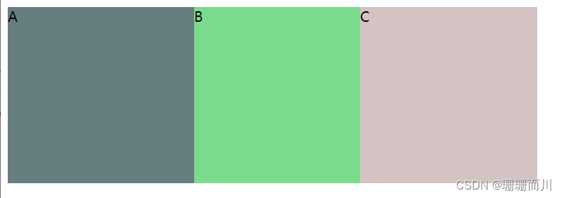
<style > .father{ width: 600px; height: 200px; /* display: table-row;不行,是行内元素了 */ display: table; background-color: #db7b7b; } .inner{ display: table-cell; } style> <body> <div class="father"> <div class="inner" style="background-color: #677e80;"> A div> <div class="inner" style="background-color: #7bdb8d;"> B div> <div class="inner" style="background-color: #d3c3c3;"> C div> div> body>- 1
- 2
- 3
- 4
- 5
- 6
- 7
- 8
- 9
- 10
- 11
- 12
- 13
- 14
- 15
- 16
- 17
- 18
- 19
- 20
- 21
实现盒子2等分
同上
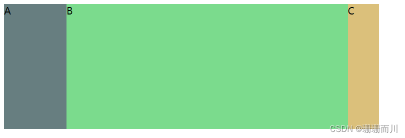
三栏布局,中间自适应

<style > .father{ width: 100%; height: 200px; /* display: table-row;不行,是行内元素了 */ display: table; background-color: #db7b7b; } .inner{ display: table-cell; } .inner1{ width: 100px; } .inner2{ } .inner3{ width: 50px; } style> <body> <div class="father"> <div class="inner inner1" style="background-color: #677e80;"> A div> <div class="inner" style="background-color: #7bdb8d;"> B div> <div class="inner inner3" style="background-color: #d3c3c3;"> C div> div> body>- 1
- 2
- 3
- 4
- 5
- 6
- 7
- 8
- 9
- 10
- 11
- 12
- 13
- 14
- 15
- 16
- 17
- 18
- 19
- 20
- 21
- 22
- 23
- 24
- 25
- 26
- 27
- 28
- 29
- 30
两栏布局,右侧自适应
同上
水平垂直居中
<style > .father{ width: 600px; height: 200px; display: table-cell; text-align: center; vertical-align: middle; background-color: #db7b7b; } .son{ display: inline-block; } style> <body> <div class="father"> <div class="son" style="background-color: #677e80;"> A div> div> body>- 1
- 2
- 3
- 4
- 5
- 6
- 7
- 8
- 9
- 10
- 11
- 12
- 13
- 14
- 15
- 16
- 17
- 18
- 19
- 20
- 21
- 22
- 23
三、grid布局
3.1 grid布局介绍
号称是最强大的的 CSS 布局方案,是目前唯一一种 CSS 二维布局。
与flex布局的区别
flex是一维布局,一次只能处理一个维度上的元素布局,一行或者一列。
而grid是二维布局,一次只能处理一个维度上的元素布局,一行或者一列。

创建Grid布局
display:grid该容器是一个块级元素
display:inline-grid该容器是一个行内块元素设置行高、列宽
grid-template-rows设置网格的行高
grid-template-columns定义列宽1. 固定列宽和行高
grid-template-columns: 200px 100px 200px;设置3列,列宽分别是200 、100、200
grid-template-rows: repeat(2, 50px);等价于grid-template-rows: repeat(2, 50px);2. 设置份数
grid-template-columns: 200px 1fr 2fr;

grid-template-columns: 1fr 2fr 3fr;

3. auto
grid-template-columns: 100px auto 100px;第一第三列为 100px,中间由浏览器决定长度布局
justify-content 属性、align-content 属性 place-content
justify-content 属性是整个内容区域在容器里面的水平位置(左中右),align-content 属性是整个内容区域的垂直位置(上中下)。它们都有如下的属性值。
place-content属性是align-content属性和justify-content属性的合并简写形式。如果省略第二个值,浏览器就会假定第二个值等于第一个值。.container { justify-content: start | end | center | stretch | space-around | space-between | space-evenly; align-content: start | end | center | stretch | space-around | space-between | space-evenly; }- 1
- 2
- 3
- 4
- space-around - 每个项目两侧的间隔相等。所以,项目之间的间隔比项目与容器边框的间隔大一倍
- space-between - 项目与项目的间隔相等,项目与容器边框之间没有间隔
- space-evenly - 项目与项目的间隔相等,项目与容器边框之间也是同样长度的间隔
- stretch - 项目大小没有指定时,拉伸占据整个网格容器

justify-items 属性、align-items 和 place-items
justify-items 属性设置单元格内容的水平位置(左中右),align-items 属性设置单元格的垂直位置(上中下)
place-items属性是align-items属性和justify-items属性的合并简写形式。如果省略第二个值,则浏览器认为与第一个值相等。.container { justify-items: start | end | center | stretch (默认; align-items: start | end | center | stretch (默认; }- 1
- 2
- 3
- 4

justify-self 属性、align-self 属性 place-self
justify-self 属性设置单元格内容的水平位置(左中右),跟 justify-items 属性的用法完全一致,但只作用于单个项目,所以属性要写在子级元素上
align-self 属性设置单元格内容的垂直位置(上中下),跟align-items属性的用法完全一致,也是只作用于单个项目
两者很相像,这里只拿 justify-self 属性演示,align-self 属性同理,只是作用于垂直方向

基本代码
<template> <div class="wrapper"> <div class="one item">One</div> <div class="two item">Two</div> <div class="three item">Three</div> <div class="four item">Four</div> <div class="five item">Five</div> <div class="six item">Six</div> </div> </template> <style lang="scss" scoped> .wrapper { display: grid; grid-template-rows: 100px 200px; grid-template-columns: 50px 100px 200px; grid-gap: 20px; width: 800px; border: 1px solid red; } .one { background: #19caad; } .two { background: #8cc7b5; } .three { background: #d1ba74; } .four { background: #bee7e9; } .five { background: #e6ceac; } .six { background: #ecad9e; } .item { color: #ffffff; } </style>- 1
- 2
- 3
- 4
- 5
- 6
- 7
- 8
- 9
- 10
- 11
- 12
- 13
- 14
- 15
- 16
- 17
- 18
- 19
- 20
- 21
- 22
- 23
- 24
- 25
- 26
- 27
- 28
- 29
- 30
- 31
- 32
- 33
- 34
- 35
- 36
- 37
- 38
- 39
- 40
- 41
- 42
- 43
效果:


3.2 grid布局实战
实现盒子3等分
<style > .father{ width: 600px; height: 200px; display: grid; /* 这三个都行 */ /* grid-template-columns: repeat(3,33.3%) ; */ grid-template-columns: repeat(3,200px); /* grid-template-columns: 1fr 1fr 1fr; */ /* grid-template-columns: repeat(3, 1fr); */ background-color: #db7b7b; } style> <body> <div class="father"> <div class="inner inner1" style="background-color: #677e80;"> A div> <div class="inner inner2" style="background-color: #7bdb8d;"> B div> <div class="inner inner2" style="background-color: #dbc07b;"> C div> div> body>- 1
- 2
- 3
- 4
- 5
- 6
- 7
- 8
- 9
- 10
- 11
- 12
- 13
- 14
- 15
- 16
- 17
- 18
- 19
- 20
- 21
- 22
- 23
- 24
- 25
实现盒子2等分
同上
三栏布局,中间自适应
<style > .father{ width: 600px; height: 200px; display: grid; grid-template-columns: 100px auto 50px; background-color: #db7b7b; } style> <body> <div class="father"> <div class="inner inner1" style="background-color: #677e80;"> A div> <div class="inner inner2" style="background-color: #7bdb8d;"> B div> <div class="inner inner2" style="background-color: #dbc07b;"> C div> div> body>- 1
- 2
- 3
- 4
- 5
- 6
- 7
- 8
- 9
- 10
- 11
- 12
- 13
- 14
- 15
- 16
- 17
- 18
- 19
- 20
- 21
- 22
两栏布局,右侧自适应
同上
水平垂直居中

<style > .father{ width: 600px; height: 200px; display: grid; place-items: center; // 相当于align-items: center;和 justify-items: center; background-color: #db7b7b; } style> <body> <div class="father"> <div class="son" style="background-color: #677e80;"> A div> div> body>- 1
- 2
- 3
- 4
- 5
- 6
- 7
- 8
- 9
- 10
- 11
- 12
- 13
- 14
- 15
- 16
- 17
- 18
- 19
- 20
-
相关阅读:
postman---postman参数化
Mybatis的原理和MybaitsPlus
Exchange Server 2016 安装部署
【软件测试】软件测试分类
数据库简史:多主数据库架构的由来和华为参天引擎的机遇
JDK动态代理
一文看懂推荐系统:排序01:多目标模型
window 11 wsl 安装docker
前端小白的学习之路(CSS3 一)
维持原判,链家程序员删除9TB数据二审判7年;AirPods或将换用USB-C接口;马斯克被推特指责违反保密协议|极客头条
- 原文地址:https://blog.csdn.net/weixin_63681863/article/details/132742742
