-
【面试题】CSS响应式
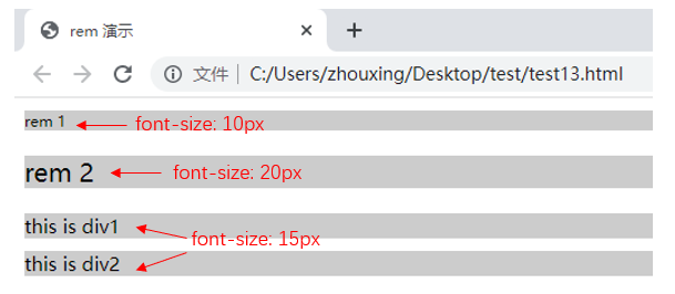
1. rem是什么?
- rem,CSS3新增的一个相对单位(root em,根em),相对于根元素,常用于响应式布局
- em,相对长度单位,相对于父元素,不常用
- px,像素(Pixel)绝对长度单位
<style> html{ font-size: 100px; } div{ background-color: #ccc; margin-top: 10px; font-size: 0.15rem; } p{background-color: #ccc;} style> <body> <p style="font-size: 0.1rem">rem 1p> <p style="font-size: 0.2rem">rem 2p> <div> this is div1 div> <div> this is div2 div> body>- 1
- 2
- 3
- 4
- 5
- 6
- 7
- 8
- 9
- 10
- 11
- 12
- 13
- 14
- 15
- 16
- 17
- 18
- 19
- 20
- 21
- 22
- 23
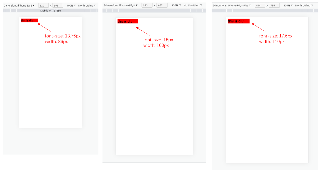
2. 响应式布局的常见方案
首先,进行media-query,根据不同的屏幕宽度设置根元素font-size。然后,通过rem,基于根元素的相对单位。
DOCTYPE html> <html lang="en"> <head> <meta charset="UTF-8"> <meta http-equiv="X-UA-Compatible" content="IE=edge"> <meta name="viewport" content="width=device-width, initial-scale=1.0"> <title>Documenttitle> <style> /* iphone5 或者更小的尺寸 */ @media only screen and (max-width: 374px){ html{ font-size: 86px; } } /* iphone6/7/8 和 iphone x */ @media only screen and (min-width: 375px) and (max-width: 413px){ html{ font-size: 100px; } } /* iphone6p 或者更大 */ @media only screen and (min-width: 375px){ html{ font-size: 110px; } } body{ font-size: 0.16rem; } #div1{ width: 1rem; background-color: red; } style> head> <body> <div id = "div1"> this is div div> body> html>- 1
- 2
- 3
- 4
- 5
- 6
- 7
- 8
- 9
- 10
- 11
- 12
- 13
- 14
- 15
- 16
- 17
- 18
- 19
- 20
- 21
- 22
- 23
- 24
- 25
- 26
- 27
- 28
- 29
- 30
- 31
- 32
- 33
- 34
- 35
- 36
- 37
- 38
- 39
- 40
- 41
- 42
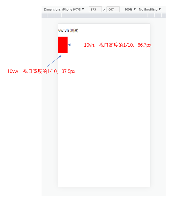
3. vm/vh
网页视口尺寸:
属性 解释 window.screen.height屏幕高度 window.innerHeight网页视口高度 document.body.clientHeightbody高度 - vh:网页视口高度的1/100
- vw:网页视口宽度的1/100
- vmax取两者最大值,vmin取两者最小值
<style> body{ margin: 0; padding: 0; } #container{ background-color: red; width: 10vw; height: 10vh; } style> <body> <p>vw vh 测试p> <div id = "container">div> body>- 1
- 2
- 3
- 4
- 5
- 6
- 7
- 8
- 9
- 10
- 11
- 12
- 13
- 14
- 15
- 16
- 17
-
相关阅读:
实景剧本杀小程序开发搭建
特殊类设计[下] --- 单例模式
9. 函数
R语言---使用runway进行机器学习模型性能的比较
Autosar模块介绍:AutosarOS(2)
Windos中部署 Elasticsearch(7.8.0)集群
Mac 安装PHP swoole扩展
【2024系统架构设计】 系统架构设计师第二版-未来信息综合技术
人工智能数学课高等数学线性微积分数学教程笔记(目录)
uniapp 微信小程序使用echarts
- 原文地址:https://blog.csdn.net/zx1041561837/article/details/127933851
