-
【CSS动效实战(纯CSS与JS动效)】02 flex 布局实战(仿 JD 及 gitCode 布局)及 media 自适应初探 下
二、flex 仿 gitCode 布局 及 自适应
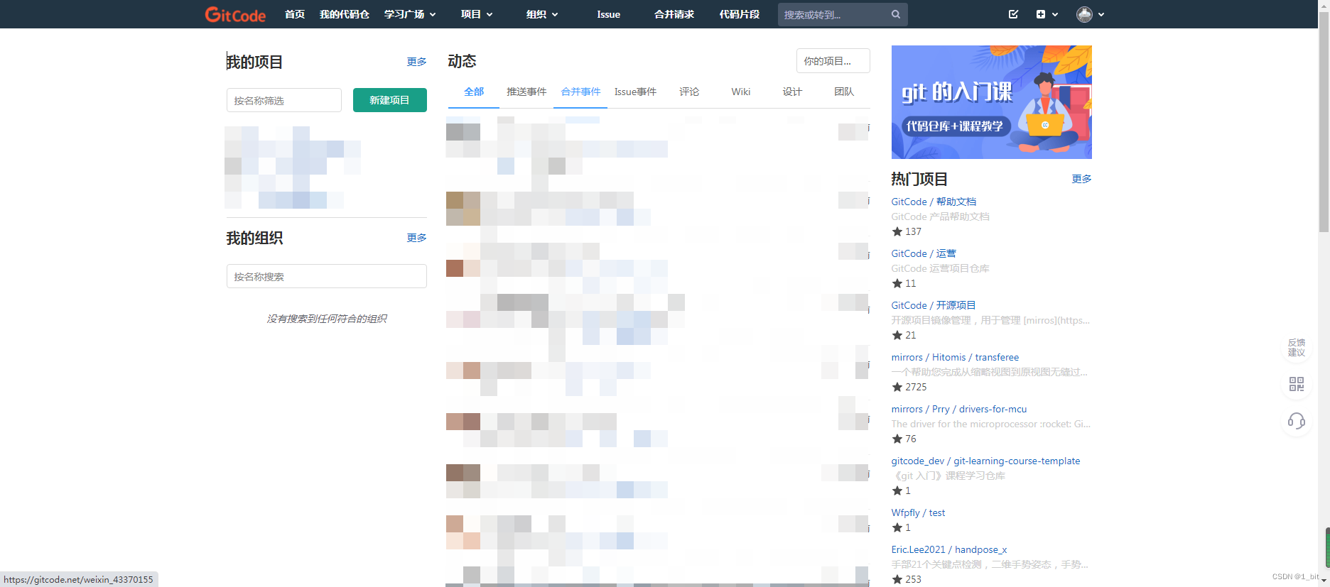
首先查看我们的页面:
这个时候直接顶部一个块,下面分为左中右三个块,然后就解决了,是不是很简单?相比刚刚那么这个简单多了。那就来做吧。2.1 基本布局
首先给一个 style 价格 flex,一样的开头:
DOCTYPE html> <html lang="en"> <head> <meta charset="UTF-8"> <meta http-equiv="X-UA-Compatible" content="IE=edge"> <meta name="viewport" content="width=device-width, initial-scale=1.0"> <title>gitcode flex demotitle> <style> .flex{ display: flex; } style> head> <body> body> html>- 1
- 2
- 3
- 4
- 5
- 6
- 7
- 8
- 9
- 10
- 11
- 12
- 13
- 14
- 15
- 16
- 17
接着 给予 body flex 样式,并且由于当前 flex 是竖着的,那么给予一个 cloumn 样式确定方向还有对应的背景色、边距等,这些都不存在什么疑问吧?学过上一小节的都看得懂吧,代码如下:
DOCTYPE html> <html lang="en"> <head> <meta charset="UTF-8"> <meta http-equiv="X-UA-Compatible" content="IE=edge"> <meta name="viewport" content="width=device-width, initial-scale=1.0"> <title>gitcode flex demotitle> <style> * { margin: 0; } body { height: 100vh; } div { background-color: white; margin: 4px } .flex{ display: flex; } .column{ flex-direction: column; } .bgcolor { background-color: rgb(230, 230, 230); } style> head> <body class="flex column bgcolor"> body> html>- 1
- 2
- 3
- 4
- 5
- 6
- 7
- 8
- 9
- 10
- 11
- 12
- 13
- 14
- 15
- 16
- 17
- 18
- 19
- 20
- 21
- 22
- 23
- 24
- 25
- 26
- 27
- 28
- 29
- 30
- 31
- 32
- 33
- 34
那么接下来咱们就在 body 里面新建两个 div:
<body class="flex column bgcolor"> <div style="height: 60px;">div> <div style="flex:1">div> body>- 1
- 2
- 3
- 4
- 5
- 6
此时页面效果如下:
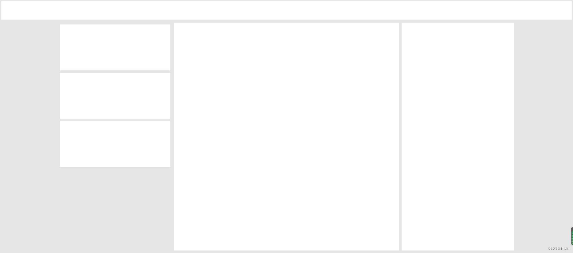
一点问题没有,那么接下来在内容的div 里新建 3 个 div 分别是左中右:<body class="flex column bgcolor"> <div style="height: 60px;">div> <div style="flex:1"> <div>div> <div>div> <div>div> div> body>- 1
- 2
- 3
- 4
- 5
- 6
- 7
- 8
- 9
- 10
- 11
- 12
- 13
一看这 3 个 div 不用占满行,那么肯定,给予这个 内容 div 一个 flex ,并且给予内部元素不大于 1 的比例即可,还有一定要给予灰色背景,不然全白了看不见:
<div class="flex bgcolor" style="flex:1"> <div style="flex:0.2">div> <div style="flex:0.4">div> <div style="flex:0.2">div> div>- 1
- 2
- 3
- 4
- 5
- 6
- 7
- 8
- 9
那么既然不占满行,那么肯定需要对应的居中,给予居中样式:
<style> .center { justify-content: center; } style>- 1
- 2
- 3
- 4
- 5
调用后页面如下:
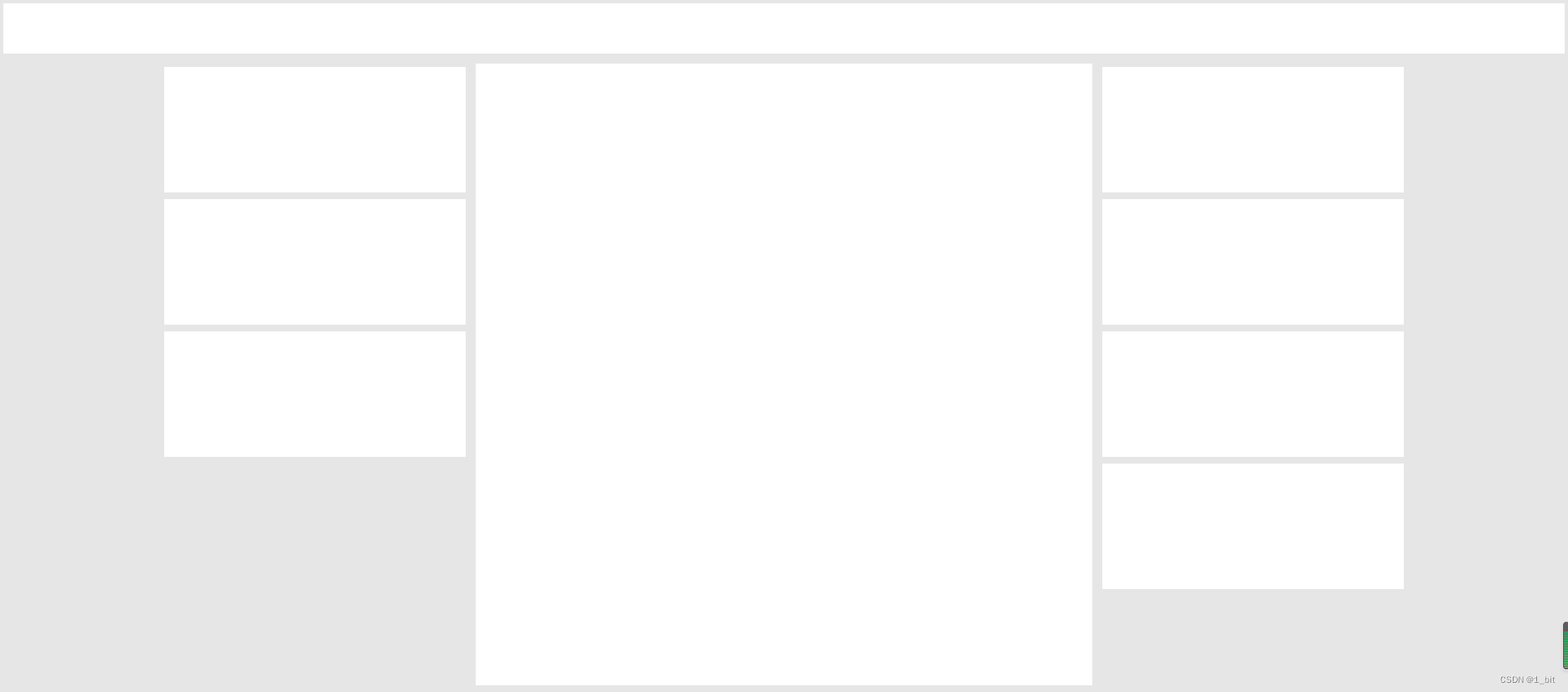
2.2 左侧元素内部排列
接着左侧一看就是竖着的:
那么给予一个样式 column 以及 flex:<div style="flex:0.2" class="column">div>- 1
- 2
接着往内部添加 3 个 div 以及对应高度,若想看见这 3 个 div,你还需要给予这个 左 的 div 背景色:
<div style="flex:0.2" class="column flex bgcolor"> <div style="height: 150px;">div> <div style="height: 150px;">div> <div style="height: 150px;">div> div>- 1
- 2
- 3
- 4
- 5
- 6
效果如下:
2.3 右侧元素内部排列
右侧也一样,直接给予多个 div 并且设置对应的 flex 样式即可:
<div style="flex:0.2" class="column flex bgcolor"> <div style="height: 150px;">div> <div style="height: 150px;">div> <div style="height: 150px;">div> <div style="height: 150px;">div> div>- 1
- 2
- 3
- 4
- 5
- 6
- 7
效果如下:
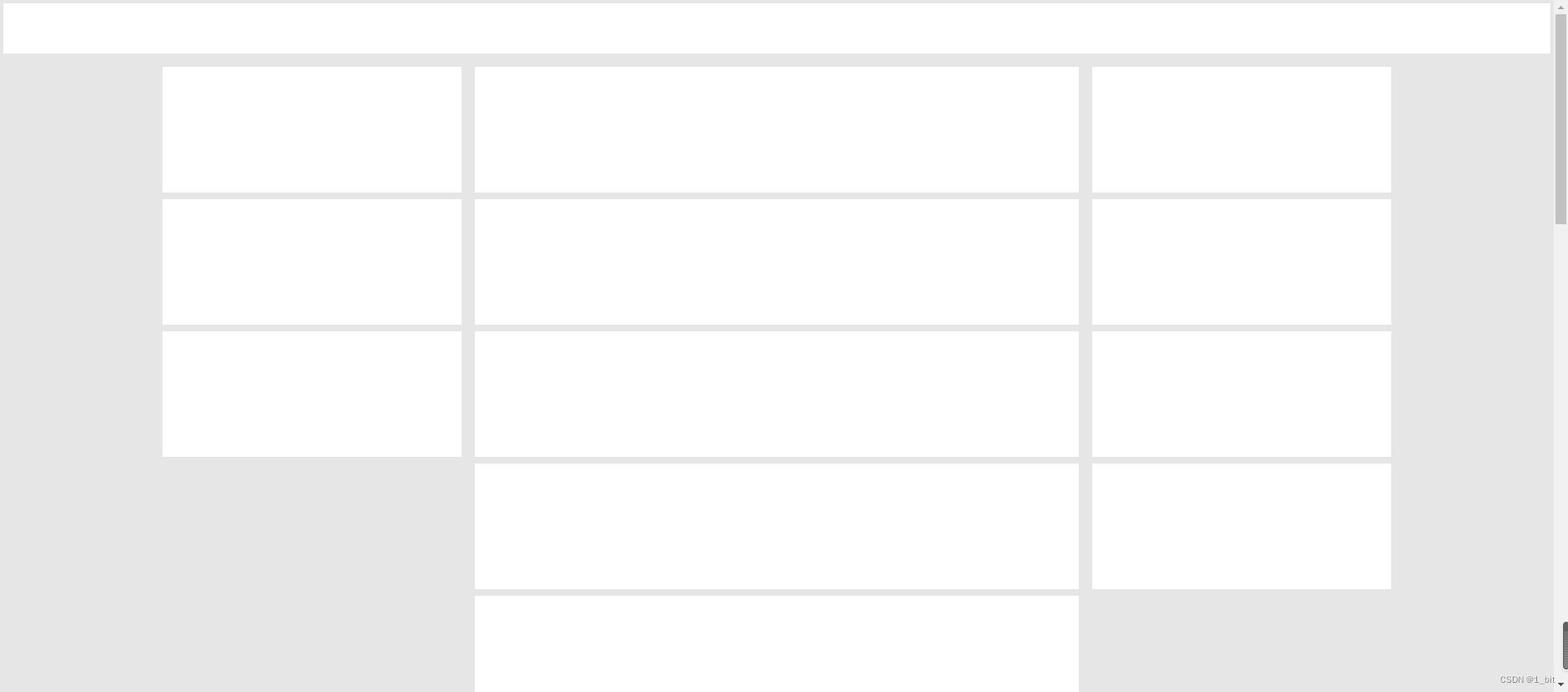
那么中间有点特殊,因为内容很多,那么这个时候我们填充内容会使顶部的内容发生挤压,那么需要一个flex-shrink: 0;使其内容不压缩,我们直接给予 头部 这个属性即可:<div style="height: 60px;flex-shrink: 0;">div>- 1
- 2
接着给予中部巨多 div 内容,并且设置对应的高度:
<div style="flex:0.4" class="column flex bgcolor"> <div style="height: 150px;">div> <div style="height: 150px;">div> <div style="height: 150px;">div> <div style="height: 150px;">div> <div style="height: 150px;">div> <div style="height: 150px;">div> <div style="height: 150px;">div> <div style="height: 150px;">div> <div style="height: 150px;">div> <div style="height: 150px;">div> <div style="height: 150px;">div> <div style="height: 150px;">div> <div style="height: 150px;">div> <div style="height: 150px;">div> <div style="height: 150px;">div> <div style="height: 150px;">div> div>- 1
- 2
- 3
- 4
- 5
- 6
- 7
- 8
- 9
- 10
- 11
- 12
- 13
- 14
- 15
- 16
- 17
- 18
- 19
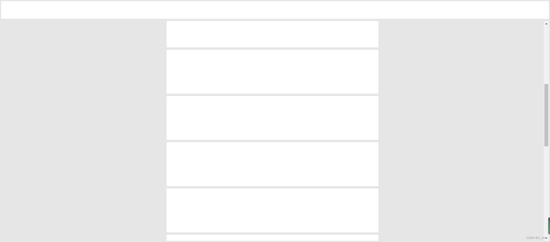
div过多超出页面后我们可以滚动查看底部 div:
但是在原本的 gitcode 页面中顶部是一直都存在的,不会拖动内容后顶部栏就消失,那么怎么做呢?我们直接给予内容的 div 一个 属性 overflow 即可:
<div class="flex bgcolor center" style="flex:1;overflow: auto;">- 1
- 2
overflow auto 会给予超出内容一个滚动条,此时滑动再多,当前页面的头部也将会一直显示:
此部分完整代码如下:DOCTYPE html> <html lang="en"> <head> <meta charset="UTF-8"> <meta http-equiv="X-UA-Compatible" content="IE=edge"> <meta name="viewport" content="width=device-width, initial-scale=1.0"> <title>gitcode flex demotitle> <style> * { margin: 0; } body { height: 100vh; } div { background-color: white; margin: 4px } .flex { display: flex; } .column { flex-direction: column; } .bgcolor { background-color: rgb(230, 230, 230); } .center { justify-content: center; } style> head> <body class="flex column bgcolor"> <div style="height: 60px;flex-shrink: 0;">div> <div class="flex bgcolor center" style="flex:1;overflow: auto;"> <div style="flex:0.2" class="column flex bgcolor"> <div style="height: 150px;">div> <div style="height: 150px;">div> <div style="height: 150px;">div> div> <div style="flex:0.4;" class="column flex bgcolor"> <div style="height: 150px;flex-shrink: 0;">div> <div style="height: 150px;flex-shrink: 0;">div> <div style="height: 150px;flex-shrink: 0;">div> <div style="height: 150px;flex-shrink: 0;">div> <div style="height: 150px;flex-shrink: 0;">div> <div style="height: 150px;flex-shrink: 0;">div> <div style="height: 150px;flex-shrink: 0;">div> <div style="height: 150px;flex-shrink: 0;">div> <div style="height: 150px;flex-shrink: 0;">div> <div style="height: 150px;flex-shrink: 0;">div> <div style="height: 150px;flex-shrink: 0;">div> <div style="height: 150px;flex-shrink: 0;">div> <div style="height: 150px;flex-shrink: 0;">div> <div style="height: 150px;flex-shrink: 0;">div> <div style="height: 150px;flex-shrink: 0;">div> <div style="height: 150px;flex-shrink: 0;">div> div> <div style="flex:0.2" class="column flex bgcolor"> <div style="height: 150px;">div> <div style="height: 150px;">div> <div style="height: 150px;">div> <div style="height: 150px;">div> div> div> body> html>- 1
- 2
- 3
- 4
- 5
- 6
- 7
- 8
- 9
- 10
- 11
- 12
- 13
- 14
- 15
- 16
- 17
- 18
- 19
- 20
- 21
- 22
- 23
- 24
- 25
- 26
- 27
- 28
- 29
- 30
- 31
- 32
- 33
- 34
- 35
- 36
- 37
- 38
- 39
- 40
- 41
- 42
- 43
- 44
- 45
- 46
- 47
- 48
- 49
- 50
- 51
- 52
- 53
- 54
- 55
- 56
- 57
- 58
- 59
- 60
- 61
- 62
- 63
- 64
- 65
- 66
- 67
- 68
- 69
- 70
- 71
- 72
- 73
- 74
- 75
- 76
- 77
- 78
- 79
- 80
- 81
2.4 自适应
有时候内容不复杂时,咱们使用自适应将会很方便,当设备是手机访问时,屏幕大小将会改变,原有 PC
页面显示有问题,那么只需要使用 media 即可解决,此时我们先创建一个 空的类样式:.<style> .content{ } style>- 1
- 2
- 3
- 4
- 5
接着,给这个 content 样式给予到内容样式之中:
<div class="content flex bgcolor center" style="flex:1;overflow: auto;">- 1
- 2
随后使用 media:
<style> @media ( max-width:600px) { .content { flex-direction: column; } } style>- 1
- 2
- 3
- 4
- 5
- 6
- 7
media 表示当
max-width:600px当前屏幕最大宽度为 600px 时,那么就是移动端设备,直接给予 content 属性为 flex-direction: column;,那么内容就会垂直显示,那么就不会并排,那么就很好的适配了手机: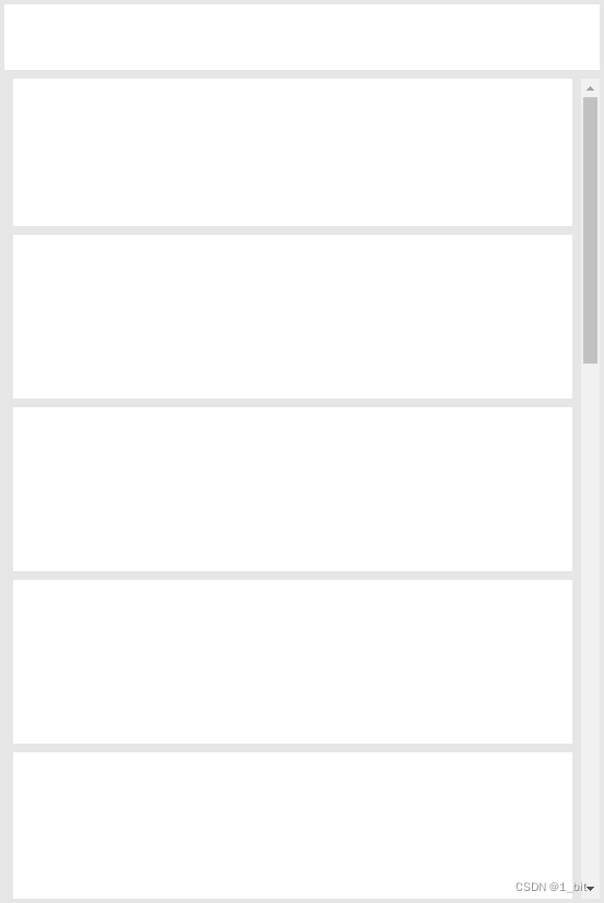
大家可以拿代码去试试,自己拖动自己的屏幕可以看得到这个效果,完整代码如下:DOCTYPE html> <html lang="en"> <head> <meta charset="UTF-8"> <meta http-equiv="X-UA-Compatible" content="IE=edge"> <meta name="viewport" content="width=device-width, initial-scale=1.0"> <title>gitcode flex demotitle> <style> * { margin: 0; } body { height: 100vh; } div { background-color: white; margin: 4px } .flex { display: flex; } .column { flex-direction: column; } .bgcolor { background-color: rgb(230, 230, 230); } .center { justify-content: center; } .content {} @media ( max-width:600px) { .content { flex-direction: column; } } style> head> <body class="flex column bgcolor"> <div style="height: 60px;flex-shrink: 0;">div> <div class="content flex bgcolor center" style="flex:1;overflow: auto;"> <div style="flex:0.2" class="column flex bgcolor"> <div style="height: 150px;">div> <div style="height: 150px;">div> <div style="height: 150px;">div> div> <div style="flex:0.4;" class="column flex bgcolor"> <div style="height: 150px;flex-shrink: 0;">div> <div style="height: 150px;flex-shrink: 0;">div> <div style="height: 150px;flex-shrink: 0;">div> <div style="height: 150px;flex-shrink: 0;">div> <div style="height: 150px;flex-shrink: 0;">div> <div style="height: 150px;flex-shrink: 0;">div> <div style="height: 150px;flex-shrink: 0;">div> <div style="height: 150px;flex-shrink: 0;">div> <div style="height: 150px;flex-shrink: 0;">div> <div style="height: 150px;flex-shrink: 0;">div> <div style="height: 150px;flex-shrink: 0;">div> <div style="height: 150px;flex-shrink: 0;">div> <div style="height: 150px;flex-shrink: 0;">div> <div style="height: 150px;flex-shrink: 0;">div> <div style="height: 150px;flex-shrink: 0;">div> <div style="height: 150px;flex-shrink: 0;">div> div> <div style="flex:0.2" class="column flex bgcolor"> <div style="height: 150px;">div> <div style="height: 150px;">div> <div style="height: 150px;">div> <div style="height: 150px;">div> div> div> body> html>- 1
- 2
- 3
- 4
- 5
- 6
- 7
- 8
- 9
- 10
- 11
- 12
- 13
- 14
- 15
- 16
- 17
- 18
- 19
- 20
- 21
- 22
- 23
- 24
- 25
- 26
- 27
- 28
- 29
- 30
- 31
- 32
- 33
- 34
- 35
- 36
- 37
- 38
- 39
- 40
- 41
- 42
- 43
- 44
- 45
- 46
- 47
- 48
- 49
- 50
- 51
- 52
- 53
- 54
- 55
- 56
- 57
- 58
- 59
- 60
- 61
- 62
- 63
- 64
- 65
- 66
- 67
- 68
- 69
- 70
- 71
- 72
- 73
- 74
- 75
- 76
- 77
- 78
- 79
- 80
- 81
- 82
- 83
- 84
- 85
- 86
- 87
- 88
- 89
-
相关阅读:
shell SNAT与DNAT
违背祖训,微软骚操作强制用户更新至 Win 11 23H2
腾讯云标准型S5服务器五年优惠价格表(4核8G和2核4G)
var、let、const关键字的特性,以及let、const暂时性死区的作用
记chrome打不开网址,无法搜索问题
Redis
Dockerfile命令详细讲解
五大常用算法——贪心算法详解及经典例子
Mac(M1芯片)安装多个jdk,Mac卸载jdk
如何利用CHATGPT写主题文章
- 原文地址:https://blog.csdn.net/A757291228/article/details/124759076
