-
web前端float布局、flex布局
1、float布局
- html>
- <html>
- <head>
- <title>Login Pagetitle>
- <style>
- body {
- font-family: Arial, sans-serif;
- background-color: #f3f3f3;
- }
- .container {
- max-width: 400px;
- margin: 0 auto;
- padding: 40px;
- background-color: #fff;
- border-radius: 5px;
- box-shadow: 0 0 10px rgba(0, 0, 0, 0.2);
- }
- .form-group {
- margin-bottom: 20px;
- }
- .form-group label {
- display: block;
- margin-bottom: 5px;
- font-weight: bold;
- }
- .form-group input {
- width: 100%;
- padding: 10px;
- font-size: 16px;
- border-radius: 5px;
- border: 1px solid #ddd;
- }
- .form-group button {
- width: 100%;
- padding: 10px;
- font-size: 16px;
- border-radius: 5px;
- background-color: #4caf50;
- color: #fff;
- border: none;
- }
- .form-group button:hover {
- background-color: #45a049;
- }
- style>
- head>
- <body>
- <div class="container">
- <h1>Loginh1>
- <form>
- <div class="form-group">
- <label for="username">Username:label>
- <input type="text" id="username" name="username" placeholder="Enter your username">
- div>
- <div class="form-group">
- <label for="password">Password:label>
- <input type="password" id="password" name="password" placeholder="Enter your password">
- div>
- <div class="form-group">
- <button type="submit">Loginbutton>
- div>
- form>
- div>
- body>
- html>
展示效果

2、flex布局
- html>
- <html lang="en">
- <head>
- <meta charset="UTF-8">
- <meta name="viewport" content="width=device-width, initial-scale=1.0">
- <title>Flex布局页面title>
- <style>
- body {
- margin: 0;
- padding: 0;
- font-family: Arial, sans-serif;
- }
- .container {
- display: flex;
- flex-direction: column;
- align-items: center;
- justify-content: center;
- min-height: 100vh;
- }
- .header {
- background-color: #3498db;
- color: #fff;
- padding: 20px;
- text-align:
- center;
- }
- .content {
- flex: 1;
- padding: 20px;
- text-align: center;
- }
- .footer {
- background-color: #333;
- color: #fff;
- padding: 10px;
- text-align: center;
- }
- style>
- head>
- <body>
- <div class="container">
- <header class="header">
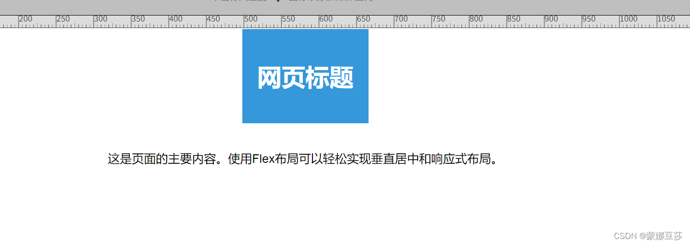
- <h1>网页标题h1>
- header>
- <main class="content">
- <p>这是页面的主要内容。使用Flex布局可以轻松实现垂直居中和响应式布局。p>
- main>
- <footer class="footer">
- <p>页脚信息 © 2023p>
- footer>
- div>
- body>
- html>
运行结果
-
相关阅读:
anr和crash文件分析,特征码提取
vue中如何导出doc文档
基于改进全卷积一阶检测器的桥梁裂缝定位算法
人工智能飞速发展的今天,IT行业能做些什么?
Java 网络编程 —— 非阻塞式编程
jvm面试题
C++数组
智能机器人无法智能对话_关于智能语音机器人使用中可能出现的问题
jmeter登陆压测的时候遇到验证码原来可以这样做
SpringBoot【开发实用篇】---- 整合第三方技术(缓存)
- 原文地址:https://blog.csdn.net/weixin_64662394/article/details/133191311
