-
【Unity3D】UI Toolkit样式选择器
1 前言
UI Toolkit简介 中介绍了样式属性,UI Toolkit容器 和 UI Toolkit元素 中介绍了容器和元素,本文将介绍样式选择器(Selector),主要包含样式类选择器(Class Selector)、C# 类选择器(Type Selector)、名称选择器(Name Selector)、通用选择器(Universal Selector)、后代选择器(Descendant Selector)、子选择器(Child Selector)、多重选择器(Multiple Selector)、伪类选择器(Pseudo Class)等。样式选择器官方介绍见→USS selectors。
2 简单选择器(Simple Selector)
简单选择器优先级:
- // * < C# Type < .Name < #Name
- // 通用选择器 < C#类选择器 < 样式类选择器 < 名称选择器
- Universal Selector < Type Selector < Class Selector < Name Selector
2.1 样式类选择器(Class Selector)
Class 选择器是命名以 "." 号开头的选择器(如:.red、.abc、.xyz 等),需要手动绑定到元素上,官方介绍见→Class selectors。
1)创建 UI
在 UI Builder 的 Hierarchy 窗口中创建 UI 如下。

显示如下。

2)创建 USS 文件
在 StyleSheets 窗口点击 "+" 号,选择 Create New USS 选项,如下。选择 USS 文件保存路径,命名为 StyleSelectorDemo。

3)创建选择器
在 StyleSheets 窗口的 selector 框中输入 ".textColor",如下。注意:textColor 前面有个点,命名可以随意,如:demo、test 等都行。

按 Enter 键后,创建了 selector,如下。

4)修改选择器的属性
选中 ".textColor" 选择器,在 Inspector 窗口修改文本颜色,如下。

5)绑定选择器到元素
将 ".textColor" 选择器拖拽到 Hierarchy 或 Viewport 窗口中相关元素上,实现样式选择器与元素的绑定。

也可以通过以下方式绑定元素:选中元素后,在 Inspector 窗口的 Style Class List 中添加 selector,如下。

选择器绑定到元素后,在 Inspector 窗口可以看到元素绑定的选择器,如下。可以通过后面的 "x" 号删除选择器。

6)显示效果
Label 和 Button 都手动绑定了 ".textColor" 选择器,显示效果如下。

2.2 C# 类选择器(Type Selector)
Type 选择器是以元素的 C# 类名命名的选择器(如:Label、Button、VisualElement 等),会自动绑定到对应 Type 的元素上,不需要手动绑定,官方介绍见→Type selectors。
1)创建选择器
在 StyleSheets 窗口创建名为 "Label" 的选择器,如下。

2)修改选择器的属性
选中 "Label" 选择器,在 Inspector 窗口修改文本样式为斜体,如下。

3)显示效果
Label 元素会自动绑定 "Label" 选择器,Button 元素则不会,即使手动将 "Label" 选择器拖拽到 Button 元素上,也不会绑定成功。显示效果如下。

2.3 名称选择器(Name Selector)
Name 选择器是命名以 "#" 号开头的选择器(如:#Name、#Abc、#Xyz 等),会自动绑定到对应 Name 的元素上,不需要手动绑定,官方介绍见→Name selectors。
1)修改元素名
新创建的元素默认元素名为空,修改元素名如下。

2)创建选择器
在 StyleSheets 窗口创建名为 "Button1" 的选择器,如下。

3)修改选择器的属性
选中 "Button1" 选择器,在 Inspector 窗口修改背景颜色,如下。

4)显示效果
Button1 元素会自动绑定 "Button1" 选择器,Label1 元素则不会,即使手动将 "Button1" 选择器拖拽到 Label1 元素上,也不会绑定成功。显示效果如下。

2.4 通用选择器(Universal Selector)
Universal 选择器是以 "*" 号命名的选择器,会自动绑定到所有元素上,不需要手动绑定,官方介绍见→Universal selectors。
1)创建选择器
在 StyleSheets 窗口创建名为 "*" 的选择器,如下。

2)修改选择器的属性
选中 "*" 选择器,在 Inspector 窗口修改边框宽度和颜色,如下。

3)显示效果
所有元素都会自动绑定 "*" 选择器,显示效果如下。
3 复杂选择器(Complex Selector)
复杂选择器是指由多个简单选择器按照特定规则组合而成的选择器。
3.1 后代选择器(Descendant Selector)
Descendant 选择器由多个简单选择器通过空格连接而成,它匹配的是某个 UI 元素底下符合规则的所有层级的子元素,官方介绍见→Descendant selectors。
- // 在selector1匹配的子元素中匹配selector2, ...
- // 选择器的顺序不同匹配的元素也不同
- selector1 selector2 {...}
1)UI 搭建
UI 层级结构如下,其中 Background、VE1、VE2、VE3 都是 VisualElement,Label1、Label2、Label3 都是 Label。

创建以下简单选择器。其中,Lable 选择器中修改了字体大小为 30;.red 选择器中修改了背景颜色为红色,并绑定到 VE1,.green 选择器中修改了背景颜色为绿色,并绑定到 VE2;.blue 选择器中修改了背景颜色为蓝色,并绑定到 VE3。

UI 显示如下。

2)创建 Descendant 选择器
在 StyleSheets 窗口创建以下选择器。
- "#VE1 Label" 选择器:修改字体为斜体;
- ".green Label" 选择器:修改字体颜色为黑色;
- "#Background *" 选择器:设置 3px 的黄色边框。

3)显示效果
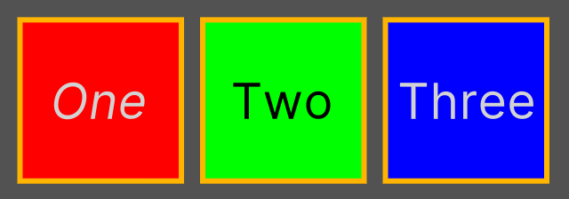
可以看到,"#VE1 Label" 选择器匹配的是 Label1 元素,".green Label" 选择器匹配的是 Label2 元素,"#Background *" 选择器匹配的是 VE1、VE2、VE3、Label1、Label2、Label3 元素。
3.2 子选择器(Child Selector)
Child 选择器由多个简单选择器通过 " > " 连接而成,它匹配的是某个 UI 元素底下符合规则的第一层级的子元素,官方介绍见→Child selectors。
- // 在selector1匹配的子元素中匹配selector2, ...
- // 选择器的顺序不同匹配的元素也不同
- selector1 > selector2 {...}
1)UI 搭建
同 3.1 1)节。
2)创建 Child 选择器
在 StyleSheets 窗口创建以下选择器。
- "#VE1 > Label" 选择器:修改字体为斜体;
- ".green > Label" 选择器:修改字体颜色为黑色;
- "#Background > *" 选择器:设置 3px 的黄色边框。

3)显示效果
可以看到,"#VE1 > Label" 选择器匹配的是 Label1 元素,".green > Label" 选择器匹配的是 Label2 元素,"#Background > *" 选择器匹配的是 VE1、VE2、VE3 元素。
3.3 多重选择器(Multiple Selector)
Multiple 选择器由多个简单选择器直接而成,它匹配的是符合所有规则的元素,官方介绍见→Multiple selectors。
- // 匹配同时满足selector1、selector2、...的元素
- // 选择器的顺序不同匹配的元素相同
- selector1selector2 {...}
说明:Class 选择器可以通过 "." 区分,Name 选择器可以通过 "#" 区分,Type 选择器没有区分符号,因此,一个多重选择器中最多允许有一个 Type 选择器,并且必须放在第一位。
1)UI 搭建
同 3.1 1)节。
2)创建 Multiple 选择器
在 StyleSheets 窗口创建以下选择器。
- "Label#Label1" 选择器:修改字体为斜体;
- "VisualElement.green" 选择器:设置圆角半径 Radius 为 20 px;
- "Label*" 选择器:设置 3px 的黄色边框。

3)显示效果

可以看到,"Label#Label1" 选择器匹配的是 Label1 元素,"VisualElement.green" 选择器匹配的是 VE2 元素,"Label*" 选择器匹配的是 Label1、Label1、Label3 元素。
4 伪类选择器(Pseudo Class)
Pseudo 选择器是指由简单选择器和状态符连接而成,它匹配的是特定状态下的元素,官方介绍见→Pseudo-classes。
- // 匹配满足selector且进入state状态的元素
- selector:state {...}
状态符主要以下几种。
- :hover:光标悬浮在元素上。
- :active:用户与元素交互。
- :inactive:用户停止与元素交互。
- :focus:元素获得焦点。
- :disabled:元素进入 disabled 状态。
- :enabled:元素进入 enabled 状态。
- :checked:Toggle 或 RadioButton 被选中。
- :root:元素成为根元素。
1)UI 搭建
同 3.1 1)节。
2)创建 Pseudo 选择器
在 StyleSheets 窗口创建以下选择器。
- "#Label1:hover" 选择器:修改字体为斜体;
- ".green:hover" 选择器:设置圆角半径 Radius 为 20 px;
- "*:hover" 选择器:设置 3px 的黄色边框。

3)显示效果

可以看到,"#Label1:hover" 选择器匹配的是进入 hover 状态的 Label1 元素,".green:hover" 选择器匹配的是进入 hover 状态的 VE2 元素,"*:hover" 选择器匹配的是进入 hover 状态的 VE1、VE2、VE3、Label1、Label1、Label3 元素。
5 样式切换
1)样式选择器的添加和删除
- // 如果visualElement有StyleName样式, 就将其删除; 如果visualElement没有StyleName样式, 就将其添加
- visualElement.ToggleInClassList("StyleName"); // StyleName是样式选择器名, 不需要前面的"."
说明:只能添加和删除样式类选择器(以 "." 命名开头的选择器),其他选择器都是自动绑定到元素上的。
2)uss 样式文件替换
- VisualElement root = GetComponent
().rootVisualElement; // 根容器 - VisualElementStyleSheetSet styleSheetSet = root.styleSheets; // 样式集合
- styleSheetSet.Remove(oldStyleSheet); // 移除旧样式, oldStyleSheet是StyleSheet类型变量, 指向一个uss文件
- styleSheetSet.Add(newlightTheme); // 添加新样式, newStyleSheet是StyleSheet类型变量, 指向一个uss文件
6 样式应用
本节将实现亮主题和暗主题的切换,完整资源见→Unity3D切换样式主题。
Page.uxml
- <ui:UXML xmlns:ui="UnityEngine.UIElements" xmlns:uie="UnityEditor.UIElements" xsi="http://www.w3.org/2001/XMLSchema-instance" engine="UnityEngine.UIElements" editor="UnityEditor.UIElements" noNamespaceSchemaLocation="../../../UIElementsSchema/UIElements.xsd" editor-extension-mode="False">
- <Style src="project://database/Assets/SwitchTheme/StyleSheets/LightTheme.uss?fileID=7433441132597879392&guid=b86be23b06b471b43a7ea453aed7df74&type=3#LightTheme" />
- <ui:VisualElement name="Background" class="bgColor" style="flex-direction: row; flex-grow: 1; background-image: url('project://database/Assets/SwitchTheme/Textures/Background_Sky.png?fileID=2800000&guid=49e1c76bfa6ef0546a39fd2bceb69b9a&type=3#Background_Sky');">
- <ui:VisualElement name="Left" style="flex-grow: 0; border-right-width: 2px; border-left-color: rgb(0, 0, 0); border-right-color: rgb(0, 0, 0); border-top-color: rgb(0, 0, 0); border-bottom-color: rgb(0, 0, 0); flex-basis: 30%;">
- <ui:VisualElement name="Top" class="dark top" style="flex-basis: 30%; margin-bottom: 0; border-bottom-width: 2px; border-left-color: rgb(0, 0, 0); border-right-color: rgb(0, 0, 0); border-top-color: rgb(0, 0, 0); border-bottom-color: rgb(0, 0, 0);" />
- <ui:VisualElement name="Middle" style="flex-basis: auto; flex-grow: 1;">
- <ui:Label text="Label" display-tooltip-when-elided="true" class="item middleBg middle" style="flex-grow: 1; -unity-text-align: middle-center; font-size: 60px; flex-shrink: 1; margin-top: 5px; margin-bottom: 5px;" />
- <ui:Label text="Theme" display-tooltip-when-elided="true" name="Theme" class="item middle" style="flex-grow: 1; -unity-text-align: middle-center; font-size: 60px; flex-shrink: 1; margin-top: 5px; margin-bottom: 5px;" />
- <ui:RadioButtonGroup value="-1" choices="Light,Drak" name="SwitchTheme" class="middle hide" style="flex-grow: 0; font-size: 45px; -unity-text-align: middle-center; align-items: center; justify-content: center; flex-direction: column; margin-left: 0; margin-right: 0; margin-top: 5px; margin-bottom: 5px; flex-shrink: 1;" />
- <ui:Label text="Label" display-tooltip-when-elided="true" class="item middle" style="flex-grow: 1; -unity-text-align: middle-center; font-size: 60px; flex-shrink: 1; margin-top: 5px; margin-bottom: 5px;" />
- ui:VisualElement>
- <ui:VisualElement name="Bottom" style="flex-basis: 25%; border-top-width: 2px; border-left-color: rgb(0, 0, 0); border-right-color: rgb(0, 0, 0); border-top-color: rgb(0, 0, 0); border-bottom-color: rgb(0, 0, 0);">
- <ui:Label text="Bottom" display-tooltip-when-elided="true" style="flex-shrink: 1; flex-grow: 1; font-size: 100px; -unity-text-align: middle-center;" />
- ui:VisualElement>
- ui:VisualElement>
- <ui:VisualElement name="Right" style="flex-grow: 0; flex-basis: 70%; align-items: center; justify-content: center;">
- <ui:Label text="Work Space" display-tooltip-when-elided="true" class="right" />
- ui:VisualElement>
- ui:VisualElement>
- ui:UXML>
LightTheme.uss
- Label {
- color: rgb(48, 47, 47);
- }
- RadioButton:hover {
- background-color: rgb(217, 217, 217);
- }
- .unity-radio-button__checkmark-background {
- margin-right: 10px;
- width: 30px;
- height: 30px;
- justify-content: center;
- align-items: center;
- border-left-width: 1px;
- border-right-width: 1px;
- border-top-width: 1px;
- border-bottom-width: 1px;
- border-top-left-radius: 20px;
- border-bottom-left-radius: 20px;
- border-top-right-radius: 20px;
- border-bottom-right-radius: 20px;
- background-color: rgb(43, 43, 43);
- border-left-color: rgba(248, 242, 242, 255);
- border-right-color: rgba(248, 242, 242, 255);
- border-top-color: rgba(248, 242, 242, 255);
- border-bottom-color: rgba(248, 242, 242, 255);
- padding-top: 0;
- }
- .unity-radio-button__checkmark {
- width: 15px;
- height: 15px;
- border-top-left-radius: 10px;
- border-bottom-left-radius: 10px;
- border-top-right-radius: 10px;
- border-bottom-right-radius: 10px;
- justify-content: center;
- align-items: center;
- background-color: rgb(217, 213, 213);
- }
- .bgColor {
- -unity-background-image-tint-color: rgb(255, 255, 255);
- }
- .top {
- background-image: url('project://database/Assets/SwitchTheme/Textures/unity_dark.png?fileID=2800000&guid=49ee81a1e2e15df46968d5d1978abc12&type=3#unity_dark');
- -unity-background-scale-mode: scale-to-fit;
- }
- .middle {
- background-color: rgba(0, 239, 255, 0.39);
- }
- .right {
- -unity-text-align: middle-center;
- -unity-font-style: bold;
- font-size: 200px;
- color: rgb(0, 168, 255);
- justify-content: center;
- align-items: center;
- -unity-text-outline-width: 1px;
- -unity-text-outline-color: rgb(255, 31, 0);
- text-shadow: 5px 2px 1px rgb(255, 255, 255);
- }
- .hide {
- display: none;
- }
- .item:hover {
- background-color: rgb(58, 56, 56);
- color: rgb(219, 216, 216);
- }
- .middle {
- background-color: rgba(0, 239, 255, 0.39);
- }
DarkTheme.uss
- Label {
- color: rgb(212, 212, 212);
- }
- RadioButton:hover {
- background-color: rgb(38, 38, 38);
- }
- .unity-radio-button__checkmark-background {
- margin-right: 10px;
- width: 30px;
- height: 30px;
- justify-content: center;
- align-items: center;
- border-left-width: 1px;
- border-right-width: 1px;
- border-top-width: 1px;
- border-bottom-width: 1px;
- border-top-left-radius: 20px;
- border-bottom-left-radius: 20px;
- border-top-right-radius: 20px;
- border-bottom-right-radius: 20px;
- background-color: rgb(255, 255, 255);
- padding-top: 0;
- }
- .unity-radio-button__checkmark {
- width: 15px;
- height: 15px;
- border-top-left-radius: 10px;
- border-bottom-left-radius: 10px;
- border-top-right-radius: 10px;
- border-bottom-right-radius: 10px;
- justify-content: center;
- align-items: center;
- background-color: rgb(51, 50, 50);
- }
- .bgColor {
- -unity-background-image-tint-color: rgb(132, 132, 132);
- }
- .top {
- background-image: url('project://database/Assets/SwitchTheme/Textures/unity_light.png?fileID=2800000&guid=92a215376eed0c9498000506d15b4afe&type=3#unity_light');
- -unity-background-scale-mode: scale-to-fit;
- }
- .middle {
- background-color: rgba(46, 44, 44, 0.39);
- }
- .right {
- -unity-text-align: middle-center;
- -unity-font-style: bold;
- font-size: 200px;
- color: rgb(197, 194, 194);
- justify-content: center;
- align-items: center;
- -unity-text-outline-width: 1px;
- -unity-text-outline-color: rgb(255, 216, 0);
- text-shadow: 5px 2px 1px rgb(53, 52, 52);
- }
- .hide {
- display: none;
- }
- .item:hover {
- background-color: rgb(214, 211, 211);
- color: rgb(46, 45, 45);
- }
SwitchTheme.cs
- using UnityEngine;
- using UnityEngine.UIElements;
- public class SwitchTheme : MonoBehaviour {
- private VisualElement root; // 根容器
- private RadioButtonGroup switchThemeElement; // 切换主题元素
- private VisualElementStyleSheetSet styleSheetSet; // 主题集合
- [SerializeField] private StyleSheet lightTheme; // 亮主题, 指向LightTheme.uss文件
- [SerializeField] private StyleSheet darkTheme; // 暗主题, 指向DarkTheme.uss文件
- private void Awake() {
- root = GetComponent
().rootVisualElement; - styleSheetSet = root.styleSheets;
- Label themeLabel = root.Q
- themeLabel.RegisterCallback
(OnClick); - switchThemeElement = root.Q
("SwitchTheme"); - switchThemeElement.RegisterValueChangedCallback(OnValueChanged);
- }
- private void OnClick(ClickEvent e) { // 点击回调函数
- switchThemeElement.ToggleInClassList("hide");
- }
- private void OnValueChanged(ChangeEvent<int> e) { // value变化回调函数
- if (e.newValue == 0) { // 切换为亮主题
- styleSheetSet.Remove(darkTheme);
- styleSheetSet.Add(lightTheme);
- } else { // 切换为暗主题
- styleSheetSet.Remove(lightTheme);
- styleSheetSet.Add(darkTheme);
- }
- }
- }
运行效果如下。

-
相关阅读:
DLL注入——使用全局钩子
【SRE】MySQL8使用方式
Linux常用命令——clock命令
【毕业设计】RFID智能门禁系统 - 单片机 物联网 嵌入式
Python 算法高级篇:贪心算法的原理与应用
盘点ERP开发的那点事-业务流和数据流
uni-app:获取当前经纬度解决方案+如何布置全局组件
vue3项目服务器静态文件部署增加指定路由地址完整实现
构建工具 Vite、Webpack、Rollup对比
在嵌入式设计中添加双向I2C数字隔离
- 原文地址:https://blog.csdn.net/m0_37602827/article/details/132670657
