-
ab4d:ab3d:ab2d--ZoomPanel for wpf
ZoomPanel
The ultimate zooming and panning control for WPF.

ZoomPanel - the ultimate Zoom control for WPF
ZoomPanel is a custom control that provides the ultimate animated zooming and panning capabilities to any WPF application.
At first, zooming and panning seems like a simple task in WPF because any element can be scaled with ScaleTransform. But when you want to integrate scrollbars, animation, mouse control, zoom to target, mini map and other features, this task quickly becomes very complicated.
Do not spend many hours developing zooming features on your own. Instead, use ZoomPanel with its ultimate zooming features and spend your precious time on other tasks.
Main features
- Support for all types of zooming and panning: move, zoom in, zoom out, rectangle zoom, reset.
- Zooming in and out with mouse wheel.
- Animated zooming for great user experience (with additional optimizations for zooming bitmap images).
- Support for custom animations.
- Support for adding ZoomPanel into ScrollViewer.
- Possibility to limit the zoom area.
- Support for dynamic and custom content that is shown based on the current zoom level - for example for zooming maps.
- Many methods and properties to customize the behavior of ZoomPanel.
- Fully customizable ZoomController to make it fit into you application's style.
- Included MiniMap control that shows which part of the content is shown. It can be used to preview which part of the content is shown. It also enables moving the shown content and zooming in and out with mouse wheel.
- Included navigator control that can be used to move around zoom area and set zoom factor with the slider.
- Detailed documentation and samples.
- Source code can be purchased also.
- Full support for multi-touch move, scale and rotate.
- Active development based on users feedback.
.Net 5 and newer notice:ZoomPanel library do not provide a special build for .Net 5 or newer framework. But the library can be still used in .Net 5 and newer frameworks because newer frameworks support using assemblies build with older framework version. But to distribute a .Net 5 or newer application you will not be able to use standard licensing with license.licx files. You will need to use licensing by using "Application license key".
Controls in the library
The main controls of the Ab2d.Controls.ZoomPanel library are:
- ZoomPanel - the main control that enables users of the application to zoom or pan the content of the ZoomPanel control. The action that is performed on mouse events are defined by the ZoomPanel's ZoomMode.
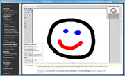
- ZoomController - the predefined zoom controller that contains buttons to change the current ZoomMode of the ZoomPanel (shown in the upper right corner of the image above).
- ZoomPanelNavigator - contains a circle with buttons to move the shown area around or reset the zoom mode. It also contains a slider to control the zoom factor (shown in the upper left corner of the image above).
- ZoomPanelMiniMap - shows which part of the content is shown. It can be used to preview which part of the content is shown. It also enables moving the shown content and zooming in and out with mouse wheel (shown in the bottom right corner of the image above).
Note: the library is available only for WPF applications - not for Silverlight.
Sample usage
WPF's vector based graphical engine is a perfect choice to display complex 2D diagrams, schemas, complex graphs and other graphical elements. It is often necessary for the user of the application to see the whole image and that the user can also zoom in to see the details. The WPF already provides some basic scaling and translating mechanism. ZoomPanel adds additional features that makes any possible zooming and panning task very easy and delivers great results.
The following code is all that is needed to use the main controls in the ZoomPanel library and produces similar results as in the image above:
<Windowx:Class="Ab2d.ZoomControlSample.ZoomPanelSample"xmlns="http://schemas.microsoft.com/winfx/2006/xaml/presentation"xmlns:x="http://schemas.microsoft.com/winfx/2006/xaml"xmlns:ab2d="clr-namespace:Ab2d.Controls;assembly=Ab2d.Controls.ZoomPanel"><Grid><ab2d:ZoomPanelName="myZoomPanel">ab2d:ZoomPanel><ab2d:ZoomControllerVerticalAlignment="Top"HorizontalAlignment="Right"/><ab2d:ZoomPanelNavigatorVerticalAlignment="Top"HorizontalAlignment="Left"/><ab2d:ZoomPanelMiniMapVerticalAlignment="Bottom"HorizontalAlignment="Right"/>Grid>Window>First we need to add reference to our assembly and add a namespace declaration to the root element. The ZoomPanel control does most of the "magic". Based on its ZoomMode it enables zooming in and out, panning, zooming to selected rectangle of the content of ZoomPanel. The ZoomController control is just a predefined ToggleButtons panel that enables user of the application to switch between different ZoomMode on ZoomPanel.
The following ZoomModes are available:
- Move mode enables moving the content of ZoomPanel with left mouse button pressed (panning).
- ZoomIn mode zooms in the content. When the left button is clicked, the location under the mouse becomes a new center of the image.
- ZoomOut mode is similar to ZoomIn, but it zooms out.
- Rectangle mode enables user to draw a rectangle with dragging the mouse - after releasing the left mouse button the content is zoomed in or out to show the area of the rectangle scaled to fit inside the ZoomPanel.
- None mode disables ZoomPanel.
In all zoom modes except None zooming in and out can be also done with mouse wheel (if not disabled by IsMouseWheelZoomEnabled property).
The ZoomPanel can be fully customized by using many of its public methods. Also a custom control can be derived from it and some core methods can be overriden to provide custom behavior.
It is also possible to create your own ZoomController - the sample application that comes with the package shows two different ways to do this.
The ZoomPanelNavigator can be used to select the zoom factor by slider and to move the shown area around with buttons. The control can be simply customized with setting your own colors, selecting orientation or showing just part of the control (only the buttons or only the slider).
The sample also places a ZoomPanelMiniMap to the bottom right corder. The control shows which part of the content is currently visible. It can be also used to move the shown area around with dragging the rectangle in the MiniMap. With mouse wheel it is also possible to zoom in and out the content of the ZoomPanel.
More information on properties and methods can be found in the help file that is included in the package.
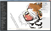
ZoomPanel is great when it is showing vector based content. It is very useful for viewing images created from svg or metafiles. The following sample is using SvgViewbox from Ab2d.ReaderSvg library to read myVectorDiagram.svg file. With ZoomPanel it is possible to zoom in the image to see additional details.
<Windowx:Class="Ab2d.ZoomControlSample.ZoomPanelSample"xmlns="http://schemas.microsoft.com/winfx/2006/xaml/presentation"xmlns:x="http://schemas.microsoft.com/winfx/2006/xaml"xmlns:ab2d="clr-namespace:Ab2d.Controls;assembly=Ab2d.Controls.ZoomPanel"xmlns:readerSvg="clr-namespace:Ab2d.Controls;assembly=Ab2d.ReaderSvg"><Grid><ab2d:ZoomPanelName="myZoomPanel"><readerSvg:SvgViewboxSource="myVectorDiagram.svg"/>ab2d:ZoomPanel>Grid>Window>The following sample is showing how to read a metafile with WmfViewbox control from Ab2d.ReaderWmf library.
<Windowx:Class="Ab2d.ZoomControlSample.ZoomPanelSample"xmlns="http://schemas.microsoft.com/winfx/2006/xaml/presentation"xmlns:x="http://schemas.microsoft.com/winfx/2006/xaml"xmlns:ab2d="clr-namespace:Ab2d.Controls;assembly=Ab2d.Controls.ZoomPanel"xmlns:readerWmf="clr-namespace:Ab2d.Controls;assembly=Ab2d.ReaderWmf"><Grid><ab2d:ZoomPanelName="myZoomPanel"><readerWmf:WmfViewboxSource="myMetafile.emf"/>ab2d:ZoomPanel>Grid>Window>Samples
The library comes with many samples that show the ZoomPanel and other controls in action. The following are two videos and screenshots from the samples (click on image to see video or a bigger screenshot):


Related Blog posts
To see the development history of Ab2d.ReaderSvg and ViewerSvg, check out the related blog posts.Version history
New in version 6.0
- Added special builds for .Net Core 3.1, .Net 5.0 and .Net 6.0.
- Added version that is distributed by a NuGet package. Note that this version uses different licensing mechanism as the version that is installed by the commercial installer.
-
相关阅读:
java计算机毕业设计江西婺源旅游文化推广系统源码+mysql数据库+系统+lw文档+部署
【算法】【字符串模块】替换字符串中连续出现的指定字符串
基于python的租车管理平台/汽车租赁网站
MySQL【视图】
二十三种设计模式全面解析-从线程安全到创新应用:探索享元模式的进阶之路
【Java】instanceof 关键字
centos7 安装hadoop
IDEA没有Add Framework Support解决办法
02-CSS属性:背景属性
【三种加载自定义控制器的方式 Objective-C语言】
- 原文地址:https://blog.csdn.net/john_dwh/article/details/127892375