-
css实现流星划过动画
背景
👏渐变+伪元素实现流星,translateY实现划过动画,速速来Get吧~
🥇文末分享源代码。记得点赞+关注+收藏!1.实现效果

2.实现原理
translateY():
translateY() 在页面垂直移动元素。
translateY(ty) 对应 translate(0, ty) 或translate3d(0, ty, 0)。rotate():
rotate() 函数定义了一种将元素围绕一个定点(由transform-origin属性指定)旋转而不变形的转换。指定的角度定义了旋转的量度。若角度为正,则顺时针方向旋转,否则逆时针方向旋转。旋转 180° 也被称为点反射。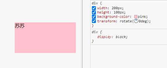
background-position:
CSS 属性为每一个背景图片设置初始位置。这个位置是相对于由 background-origin 定义的位置图层的。
3.实现步骤
3.1 实现一个流星
- linear-gradient渐变实现尾迹,由下到上进行渐变,可以得到如下的矩形
width: 5px; height: 85px; background: linear-gradient(0deg, orange 0, red 100%);- 1
- 2
- 3

- 试着将红色改为透明底色,可以得到如下的矩形
background: linear-gradient(0deg, orange 0, transparent 100%);- 1

- 在此标签上添加伪元素,实现流星的头部
content: ""; position: absolute; width: 14px; height: 14px; border-radius: 50%; background: orange; filter: blur(1.8px); bottom: -6px; left: 50%; transform: translate(-50%);- 1
- 2
- 3
- 4
- 5
- 6
- 7
- 8
- 9
- 10

- rotate旋转45deg
transform: rotate(45deg);- 1

3.2 实现多个流星
!!!注意:以下代码基于vue
- 页面存在多个流星,位置不同 ,颜色不同,可定义一个流星列表,属性包括颜色,位置,以及动画延迟delay时间等,通过css的var变量实现样式的绑定。
- 列表如下:c1和c2表示渐变的两个色值,l表示left距离,r表示right距离,d表示动画延迟时间
lineList: [ { c1: "#69E4F6", c2: "#69e4f600", l: "0px", d: 3, }, { c1: "#FED258", c2: "rgba(254,210,88,0)", l: "60px", d: 5, }, { c1: "#FED258", c2: "rgba(254,210,88,0)", r: "72px", d: 2, }, { c1: "#69E4F6", c2: "#69e4f600", r: "30px", d: 0, }, { c1: "#69E4F6", c2: "#69e4f600", r: "41px", d: 1, }, { c1: "#69E4F6", c2: "#69e4f600", l: "105px", d: 4, }, { c1: "#FED258", c2: "rgba(254,210,88,0)", l: "30px", d: 2, }, { c1: "#FED258", c2: "rgba(254,210,88,0)", r: "111px", d: 5, }, { c1: "#69E4F6", c2: "#69e4f600", r: "2px", d: 3, }, ],- 1
- 2
- 3
- 4
- 5
- 6
- 7
- 8
- 9
- 10
- 11
- 12
- 13
- 14
- 15
- 16
- 17
- 18
- 19
- 20
- 21
- 22
- 23
- 24
- 25
- 26
- 27
- 28
- 29
- 30
- 31
- 32
- 33
- 34
- 35
- 36
- 37
- 38
- 39
- 40
- 41
- 42
- 43
- 44
- 45
- 46
- 47
- 48
- 49
- 50
- 51
- 52
- 53
- 54
- 55
- 56
- 在行内样式中,写入参数
<div class="line-box"> <span class="line-item" v-for="(item,index) in lineList" :key="index" :style="{ '--c1':item.c1, '--c2':item.c2, '--l':item.l, '--d':item.d, '--r':item.r }" ></span> </div>- 1
- 2
- 3
- 4
- 5
- 6
- 7
- 8
- 9
- 10
- 11
- 12
- 13
- 14
- 线条的样式对应到var定义的变量上
.line-item { width: 2px; height: 33px; background: linear-gradient(0deg, var(--c1) 0%, var(--c2) 100%); position: absolute; top: 0; transform: rotate(45deg); left: var(--l); right: var(--r); } .line-item::after { content: ""; position: absolute; width: 7px; height: 7px; border-radius: 50%; background: var(--c1); filter: blur(1.8px); box-shadow: 0px -1px -1px 5px var(--c2); bottom: -4px; left: 50%; transform: translate(-50%); }- 1
- 2
- 3
- 4
- 5
- 6
- 7
- 8
- 9
- 10
- 11
- 12
- 13
- 14
- 15
- 16
- 17
- 18
- 19
- 20
- 21
- 22
- 23
- 24
- 按照上述内容,实现的效果如下

3.3 添加划过动画
- 所有流星默认透明度为0,不展示,若不设置为0,动画带来的延迟将会直接显示该线条,非常突兀
.line-item{ + opacity: 0; }- 1
- 2
- 3
- 手动设置translateY的大小,观察流星的位置变化

- 通过调试,写一个合适的动画(具体数值,需根据实际情况而定)
@keyframes shank { 0% { transform: rotate(45deg) translateY(-100px) scale(0.5); opacity: 0; } 70% { opacity: 1; transform: rotate(45deg) translateY(100px) scale(1.1); } 100% { transform: rotate(45deg) translateY(220px) scale(0.5); opacity: 0; } }- 1
- 2
- 3
- 4
- 5
- 6
- 7
- 8
- 9
- 10
- 11
- 12
- 13
- 14
- 15
- 16
- 给每个流星线条添加动画以及延迟,通过延迟使其有一定的视觉差
.line-item{ + animation: shank 2s linear infinite; + animation-delay: calc(var(--d) * 0.2s); }- 1
- 2
- 3
- 4

- 流星总体偏左,不够协调,可以改变其初始位置,(left或者right),或者直接在其位置上添加一定的偏移量,使其更加的和谐
.line-item{ - left: var(--l); - right: var(--r); + left: calc(var(--l) + 70px); + right: calc(var(--r) - 70px); }- 1
- 2
- 3
- 4
- 5
- 6

3.4 页面添加背景并设置动画
- 添加背景
- 给背景设置一个background-position的动画
.container::before { content: ""; position: absolute; width: 100%; height: 100%; left: 0; top: 0; background: url(./img/earth.jpg) no-repeat; background-size: cover; animation: ping 4s infinite linear alternate-reverse; } @keyframes ping { 100% { background-position: 100%; } }- 1
- 2
- 3
- 4
- 5
- 6
- 7
- 8
- 9
- 10
- 11
- 12
- 13
- 14
- 15
- 16
4.实现代码
- 样式代码
.container { box-shadow: 0px 2px 12px rgba(0, 0, 0, 0.2); border-radius: 20px; padding: 40px; position: relative; width: 350px; height: 260px; overflow: hidden; } .container::before { content: ""; position: absolute; width: 100%; height: 100%; left: 0; top: 0; background: url(./img/earth.jpg) no-repeat; background-size: cover; animation: ping 4s infinite linear alternate-reverse; } @keyframes ping { 100% { background-position: 100%; } } .line-box { width: 100%; height: 100%; position: relative; } .line-item { width: 2px; height: 33px; background: linear-gradient(0deg, var(--c1) 0%, var(--c2) 100%); position: absolute; top: 0; transform: rotate(45deg); left: calc(var(--l) + 70px); right: calc(var(--r) - 70px); opacity: 0; animation: shank 2s linear infinite; animation-delay: calc(var(--d) * 0.2s); } .line-item::after { content: ""; position: absolute; width: 7px; height: 7px; border-radius: 50%; background: var(--c1); filter: blur(1.8px); box-shadow: 0px -1px -1px 5px var(--c2); bottom: -4px; left: 50%; transform: translate(-50%); } @keyframes shank { 0% { transform: rotate(45deg) translateY(-100px) scale(0.5); opacity: 0; } 70% { opacity: 1; transform: rotate(45deg) translateY(100px) scale(1.1); } 100% { transform: rotate(45deg) translateY(220px) scale(0.5); opacity: 0; } }- 1
- 2
- 3
- 4
- 5
- 6
- 7
- 8
- 9
- 10
- 11
- 12
- 13
- 14
- 15
- 16
- 17
- 18
- 19
- 20
- 21
- 22
- 23
- 24
- 25
- 26
- 27
- 28
- 29
- 30
- 31
- 32
- 33
- 34
- 35
- 36
- 37
- 38
- 39
- 40
- 41
- 42
- 43
- 44
- 45
- 46
- 47
- 48
- 49
- 50
- 51
- 52
- 53
- 54
- 55
- 56
- 57
- 58
- 59
- 60
- 61
- 62
- 63
- 64
- 65
- 66
- 67
- 68
- 69
- 70
- 71
- 72
- 73
- 74
- 75
- 页面代码
<div class="container" > <div class="line-box"> <span class="line-item" v-for="(item,index) in lineList" :key="index" :style="{ '--c1':item.c1, '--c2':item.c2, '--w':item.w, '--h':item.h, '--l':item.l, '--d':item.d, '--r':item.r }" ></span> </div> </div>- 1
- 2
- 3
- 4
- 5
- 6
- 7
- 8
- 9
- 10
- 11
- 12
- 13
- 14
- 15
- 16
- 17
- 18
- lineList代码如3.2章节所示
5.写在最后🍒
看完本文如果觉得对你有一丢丢帮助,记得点赞+关注+收藏鸭 🍕
更多相关内容,关注🍥苏苏的bug,🍡苏苏的github,🍪苏苏的码云~
-
相关阅读:
4.git本地仓库操作(操作命令)
网络安全(黑客)小白自学
【机器学习】21天挑战赛学习笔记(一)
图像分类相关优质开源数据集汇总(附下载链接)
C#正则将字符替换为其它,正则排除中文
2023-9-8 求组合数(三)
NPDP日常练习题
成都睿趣科技:抖音卖货需要什么手续费
网络安全(黑客)自学
拿下Spring全家桶后,我跳槽了
- 原文地址:https://blog.csdn.net/qq_48085286/article/details/127876866