-
WPF探究【一】
WPF的概述:
- WindowsPresentationFoundation(简称WPF)
- WPF的核心是一个与分辩率无关且基于实量的呈现引擎,自在充分利用现代图形硬件。WPF通过一套完善的应用程序开发功能对该核心进行了扩展,这些功能包括可扩展应用程序标记语言(XAML)、控件、数据绑定、布局、二维和三维图形、动画、样式、模板、文档、媒体、文本和版式。WPF属于.NET,因此可以生成整合.NETAPI其他元素的应用程序。
- 简介:
- Windows用户界面框架统一的编程模型、语言和框架,做到了界面设计与后端升发分离。
- 特点:
- 呈现效果不受分解率的影响。
- 基于Directx3d技术,可以做出炫酷的界面。
- 提供UI框架,集成了失量图形、流动文字支持、3d视觉效果和控件模型框架。
- UI与业务逻辑彻底分离。
- UI-XAML描述(底层wpf引擎是把元素解释成对应的对象。
- 基于数据驱动、数据是核心。
控件分类
- System.Windows.Controls
Label(表示控件的文本标签,并提供访问密钥支持。) TextBox(显示或编辑无格式文本) TextBlock(一个轻型控件用于显示少量流内容) Border(边框控件,作用:在另一个元素四周绘制边框和/或背景) Button(按钮控件) Calendar(日历控件) CheckBox(选择框) ComboBox(下拉框) Image(图片控件) Menu(菜单) ContextMenu(内容菜单) RadioButton(表示可由用户选择但不能清除的按钮代码能清除) DataGrid(数据网格-Table) ListBox(包含可选项列表) Listview(表示用于显示数据项列表的控件 XAML
- XML是一种声明性标记语言应用于.NET Core编程模型时,XAML简化了为.NET Core应用创建UI的过程。
- XAML文件是通常具有.xaml扩展名的XML文件。
- 可通过任何XML编码对文件进行编码,但通常以UTF-8编码。
<StackPanel> <Button Content="Click Me"> </StackPanel>- 1
- 2
- 3
对象元素语法
- 对象元素语法是XAML标记语法,它通过声明XML元素来实例化CLR类或结构。此语法类似于其他标记语言(如HTML)的元素语法
- 单标签格式。
- 双标签格式。
...
XAML根元素
- 一个XAML文件只能有一个根元素,这样才能同时作为格式正确的XML文件和有效的XAML文件。对于典型WPF方案,可使用在WPF应用模型中具有突出意义的根元素(例如,页面的Window或Page)
- 在根标签下面有且只能有一个二级标签。在二级标签里面我们可以写多个三级四级标签。
<Window > <Grid > </Grid> </Window>- 1
- 2
- 3
- 4
- 5
WPF和XAML命名空间声明
- 在许多XAML文件的根标记中的命名空间声明内,通常可看到两个XML命名空间声明。
- 第一个声明默认映射整个WPF客户端/框架XAML命名空间:
xmlns="http://schemas.microsoft.com/winfx/2006/xaml/presentation
第二个声明映射单独的XAML命名空间,(通常)将其映射到x:前缀xmlns:x="http://schemas.microsoft.com/winfx/2006/xaml - 这些声明之间的关系是x:前缀映射支持作为xaml语言定义一部分的内部函数,而WPF是一种将xaml用作语言的实现,并为xaml定义了其对象的词汇。
<Window x:Class="wpf1.Controls.WindowLabel" xmlns="http://schemas.microsoft.com/winfx/2006/xaml/presentation" xmlns:x="http://schemas.microsoft.com/winfx/2006/xaml" xmlns:d="http://schemas.microsoft.com/expression/blend/2008" xmlns:mc="http://schemas.openxmlformats.org/markup-compatibility/2006" xmlns:local="clr-namespace:wpf1.Controls" mc:Ignorable="d" Title="WindowLabel" Height="450" Width="800"> <Grid > </Grid> </Window>- 1
- 2
- 3
- 4
- 5
- 6
- 7
- 8
- 9
- 10
- 11
控件
Lablel
命名空间:
System.Windows.Controls
程序集:PresentationFramework.dll
表示控件的文本标签,并提供访问密钥支持[System.Windows.Localizability(System.Windows.LocalizationCategory.Label)] public classLabel:System.Windous.Controls.ContentControl- 1
- 2
继承Object →DispatcherObject →DependencyObject →Visual→UIElement →FrameworkElement→Control→ContentControl→Label
属性LocalizabilityAttribute示例
以下示例演示如何创建一个Label使用绑定来设置目标
<Window x:Class="wpf1.Controls.WindowLabel" xmlns="http://schemas.microsoft.com/winfx/2006/xaml/presentation" xmlns:x="http://schemas.microsoft.com/winfx/2006/xaml" xmlns:d="http://schemas.microsoft.com/expression/blend/2008" xmlns:mc="http://schemas.openxmlformats.org/markup-compatibility/2006" xmlns:local="clr-namespace:wpf1.Controls" mc:Ignorable="d" Title="WindowLabel" Height="450" Width="800"> <Grid RenderTransformOrigin="0.5,0.5" Margin="1,-2,481,293"> <!--水平方向排列设置HorizontalAlignment--> <!--垂直方向排列设置VerticalAlignment--> <!--外边距,使用Margin四个数字对应方向为左上右下,一个数字代表所有外边距--> <Label Width="100" Height="30" Content="我是一个Label控件" HorizontalAlignment="Center" VerticalAlignment="Center" Margin="0,10,10,0" FontSize="14" Foreground="Blue"> </Label> </Grid> </Window>- 1
- 2
- 3
- 4
- 5
- 6
- 7
- 8
- 9
- 10
- 11
- 12
- 13
- 14
- 15
- 16
- 17
- 18
- 19
- 20
- 21
继承关系

- 对象:System.Windows.FrameworkElement
- 属性
属性名 对象类型 作用 Width double 获取或设置元素的宽度。 Height double 获取或设置元素的高度。 Actualwidth double 获取此元素的呈现的宽度 ActualHeight double 获取此元素的呈现的高度 Name string 获取或设置元素的标识名称。该名称提供引用,以便代码隐藏(如事件处理程序代码)可以引用标记元素(在XAML处理器的处理过程中构造该元素之后)。 Style Style 获取或设置此元素呈现时所使用的样式 Margin Thickness 获取或设置元素的外边距。 HorizontalAlianment HorizontalAlignment 获取或设置在父元素(如Panel或项控件)中组合此元素时所应用的水平对齐特征。【水平对齐设置,它是一个枚举值。) FocusVisualstyle Style 获取或设置一个属性,该属性允许自定义此元素在捕获到键盘焦点时要应用于此元素的外观、效果或其他样式特征 FlowDirection FlowDirection 获取或设置方向,文本和其他用户界面(U1元素在任何控制其布局的父元素中都按此方向流动。 object DataContext 获取或设置元素参与数据绑定时的数据上下文。 - 方法
方法名 参数 作用 BningintoView 尝试将此元素放入视图,它包含在任何可滚动区域内。 BringintoView(Rect targetRectangle) 指定也放入视图的元素的大小。 尝试将放入视图,它包含在任何可滚动区域内的此元素提供的区域大小 FindName(string name) 所请求元素的名称(name) 查找具有提供的标识符名的元素 FindResource(object resourceKey) 所请求的资源键标(resourcekey) 搜索具有指定键的资源并在引发异常,如果找不到所请求的资源。 - 事件
事件名称 作用 Loaded 当对元素进行布局、呈现,且可将其用于交互时发生。 KeyDown 当焦点在该元素上时按下某个键后发生 GotFocus 在此元素获得逻辑焦点时发生 MouseDown MouseMove 在鼠标指针位于此元素上并且移动鼠标指针时发生。 Click 控件的点击事件 TextBlock
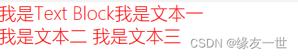
<Window x:Class="wpf1.WindowTextBlock" xmlns="http://schemas.microsoft.com/winfx/2006/xaml/presentation" xmlns:x="http://schemas.microsoft.com/winfx/2006/xaml" xmlns:d="http://schemas.microsoft.com/expression/blend/2008" xmlns:mc="http://schemas.openxmlformats.org/markup-compatibility/2006" xmlns:local="clr-namespace:wpf1" mc:Ignorable="d" Title="WindowTextBlock" Height="450" Width="800"> <Grid> <!--text设置的内容,会被标签内的内容覆盖 如果想进行换行操作,可以在TextBlock双标签里面加上LinkBreak --> <TextBlock Text="我是Text Block" FontSize="20" FontWeight="Light" Foreground="Red"> 我是文本一<LineBreak/> 我是文本二<Hyperlink/> 我是文本三<LineBreak/> </TextBlock> </Grid> </Window>- 1
- 2
- 3
- 4
- 5
- 6
- 7
- 8
- 9
- 10
- 11
- 12
- 13
- 14
- 15
- 16
- 17
- 18
- 19
- 20
button
<Window x:Class="wpf1.WindowButtton" xmlns="http://schemas.microsoft.com/winfx/2006/xaml/presentation" xmlns:x="http://schemas.microsoft.com/winfx/2006/xaml" xmlns:d="http://schemas.microsoft.com/expression/blend/2008" xmlns:mc="http://schemas.openxmlformats.org/markup-compatibility/2006" xmlns:local="clr-namespace:wpf1" mc:Ignorable="d" Title="WindowButton" Height="450" Width="800"> <Grid> <!--按f12进入事件处理程序--> <Button Width="100" Height="30" HorizontalAlignment="Left" VerticalAlignment="Top" Content="我是按钮1" Margin="20,20,0,0" Background="Teal" BorderBrush="Transparent" Foreground="White" Click="Button_Click_1" MouseMove="Button_MouseMove"></Button> <Button Width="100" Height="30" HorizontalAlignment="Left" VerticalAlignment="Top" Content="我是按钮1" Margin="160,20,0,0" Background="Teal" BorderBrush="Transparent" Foreground="White" Click="Button_Click_2" ></Button> <Button Background="Teal" Width="150" Height="30" Margin="300,20,0,0" HorizontalAlignment="Left" VerticalAlignment="Top" Content="右击检查快捷菜单" Foreground="White"> <Button.ContextMenu> <ContextMenu> <MenuItem Header="子菜单1">快捷菜单项1</MenuItem> <MenuItem Header="子菜单2">快捷菜单项2</MenuItem> </ContextMenu> </Button.ContextMenu> </Button> </Grid> </Window>- 1
- 2
- 3
- 4
- 5
- 6
- 7
- 8
- 9
- 10
- 11
- 12
- 13
- 14
- 15
- 16
- 17
- 18
- 19
- 20
- 21
- 22
- 23
- 24
- 25
- 26
- 27
- 28
- 29
- 30
- 31
namespace wpf1 { ////// WindowButtton.xaml 的交互逻辑 /// public partial class WindowButtton : Window { public WindowButtton() { InitializeComponent(); } private void Button_Click_2(object sender, RoutedEventArgs e) { MessageBox.Show("按钮被点击了"); } private void Button_MouseMove(object sender, MouseEventArgs e) { MessageBox.Show("鼠标移到了按钮上!"); } private void Button_Click_1(object sender, RoutedEventArgs e) { } } } - 1
- 2
- 3
- 4
- 5
- 6
- 7
- 8
- 9
- 10
- 11
- 12
- 13
- 14
- 15
- 16
- 17
- 18
- 19
- 20
- 21
- 22
- 23
- 24
- 25
- 26
- 27
- 28
- 29
- 30

Border
-
System.Windows.Controls.Border继承自Decorator类
-
在另一个元素四周绘制边框/背景。
-
若要显示多个子元素只能有一个孩子。,需要在父Border元素中放置一个附加Panel元素。然后,Border可以将子元素放置在该Panel元素中。由grid是继承Panel,所以在Border中添加Grid即可

-
如果要在内容周围显示边框则必须将元素放置在父Border元素中。
-
CornerRadius获取或设置一个值,该值表示将border的角倒圆的程度。
<Window x:Class="wpf1.WindowBorder" xmlns="http://schemas.microsoft.com/winfx/2006/xaml/presentation" xmlns:x="http://schemas.microsoft.com/winfx/2006/xaml" xmlns:d="http://schemas.microsoft.com/expression/blend/2008" xmlns:mc="http://schemas.openxmlformats.org/markup-compatibility/2006" xmlns:local="clr-namespace:wpf1" mc:Ignorable="d" Title="WindowBorder" Height="450" Width="800"> <Grid> <!-- BorderThickness边框宽度默认为0 直接设置一个参数代表的是四周 四个参数 左、上、右、下 设置边框颜色加上边框宽度,才能准确显示边框的效果。 如果需要设置角的弧度。 需要使用cornerRadius属性。 --> <Border Background="LightBlue" BorderBrush="red" BorderThickness="2" Margin="300,186,240,130"> <Grid Margin="0,0,0,19"> <Label Foreground="Blue" FontSize="20" FontFamily="楷体" Margin="86,27,0,0"> Labler内容1 </Label> <Label Foreground="Blue" FontSize="20" FontFamily="楷体" Margin="0,1,38,-1"> Labler内容2 </Label> </Grid> </Border> <Border BorderBrush="Black" BorderThickness="2" Margin="0,186,595,169" Background="LightBlue" CornerRadius="50"> <Button Background="Transparent" FontSize="20" Content="测试按钮" Foreground="BlueViolet" Click="Button_Click" BorderBrush="Transparent"></Button> </Border> </Grid> </Window>- 1
- 2
- 3
- 4
- 5
- 6
- 7
- 8
- 9
- 10
- 11
- 12
- 13
- 14
- 15
- 16
- 17
- 18
- 19
- 20
- 21
- 22
- 23
- 24
- 25
- 26
- 27
- 28
- 29
- 30
- 31
- 32
- 33
- 34
- 35
- 36
- 37
namespace wpf1 { ////// WindowBorder.xaml 的交互逻辑 /// public partial class WindowBorder : Window { public WindowBorder() { InitializeComponent(); } private void Button_Click(object sender, RoutedEventArgs e) { MessageBox.Show("成功测试按钮"); } } } - 1
- 2
- 3
- 4
- 5
- 6
- 7
- 8
- 9
- 10
- 11
- 12
- 13
- 14
- 15
- 16
- 17
- 18
- 19

-
相关阅读:
kali中文输入法
【HAL库】STM32CubeMX开发----STM32F407----CAN通信实验
Elasticsearch实战(二十)---ES相关度分数评分算法分析及相关度分数优化
自组织神经网络算法流程,神经网络算法流程设计
计网自顶向下(Web服务器+UDPping+邮件客户端)
基于鹈鹕优化的BP神经网络(分类应用) - 附代码
OptiFDTD应用:纳米盘型谐振腔等离子体波导滤波器
第九章Redis持久化
【BOOST C++ 18 数字处理】(2)Boost.Accumulators
[极客大挑战 2019]Havefun
- 原文地址:https://blog.csdn.net/yang2330648064/article/details/127627139
