-
人工智能--机器学习概述、motplotlib的使用-折线图、散点图、柱状图、饼图
机器学习
步骤:
获取数据–数据基本处理–特征工程–机器学习(算法)–模型评估与调优人工智能三要素:数据、算法、计算力
CPU 控制单元多,计算单元少—更适合IO密集型任务
GPU计算单元多----更适合计算密集型任务机器学习是人工智能的一个实现途径
深度学习是机器学习的一个方法发展而来人工智能
图灵测试 :30%以上的概率分不出是人还是机器
1956年–人工智能元年

主要分支:计算机视觉CV 、语言识别、文本挖掘/分类、机器翻译、机器人计算机视觉CV:计算机感知环境的能力
语言识别:识别语音转化成对应文本(科大讯飞)鸡尾酒会效应
文本挖掘/分类:句法分析、情绪分析、垃圾信息检测
机器人:机器人的涉及、制造、运作和应用
获取数据–数据基本处理–特征工程–机器学习–模型评估机器学习:从数据中自动分析获得模型,利用模型对未知数据进行预测
特征工程
特征工程:使用知识和技巧处理数据,使得特征能在机器学习算法上发挥更好的作用的过程。
特征工程内容:特征提取、特征预处理、特征降维
数据和特征决定机器学习的上限,模型和算法只是逼近这个上限模型评估:
分类–准确率 召回率、AUC指标
回归 — RMSE均方根误差、相对均分误差、平均绝对误差、相对绝对误差欠拟合:训练集中表现不好,测试集也不好
过拟合:训练集合中表现过好,测试集不好Azure平台–拖拽实现机器学习
一级标题
二级标题
三级标题
- 一级缩进
- 二级缩进
- 三级缩进
- 二级缩进
shift + enter 执行本单元代码,并跳转到下一单元
ctrl +enter 执行本单元代码,留在本单元motplotlib的使用
步骤:
- 创建画布 plt.figure()
- 绘制图像 plt.plot()
- 图像显示 plt.show()
import matplotlib.pyplot as plt # 1. 创建画布 plt.figure(figsize=(20,8),dpi = 100) #画布大小,图形清晰度 # 2. 绘制图像 plt.plot([1,2,3,4,5,6,7],[10,15,13,18,16,20,10]) #3. 图像显示 plt.show()- 1
- 2
- 3
- 4
- 5
- 6
- 7
1 基础绘图工具
import matplotlib.pyplot as plt import random #0,准备数据 x = range(60) y = [random.uniform(15,18) for i in x] #1,创建画布 plt.figure(figsize = (20,8),dpi = 100) #2,绘制图形 plt.plot(x,y_shanghai) #3,图像显示 plt.show()- 1
- 2
- 3
- 4
- 5
- 6
- 7
- 8
- 9
- 10
- 11
- 12
- 13
Matplotlib三层结构:
- 容器层: 1,Canvas 画板 2,Figure画布 3,坐标系Axes
- 辅助层 :刻度,坐标标题,网格,图例,图形标题
- 图像层:折线图、散点图、柱状图、。。
1.1添加自定义的x,y刻度、网格、描述性信息、图像保存
import matplotlib.pyplot as plt import random #让图像正常显示中文的代码!!!!! from pylab import mpl #设置显示中文字体 mpl.rcParams['font.sans-serif'] = ['SimHei'] #设置正常显示符合 mpl.rcParams['axes.unicode_minus'] = False #0,准备数据 x = range(60) y = [random.uniform(15,18) for i in x]- 1
- 2
- 3
- 4
- 5
- 6
- 7
- 8
- 9
- 10
- 11
- 12
- 13
#1,创建画布 plt.figure(figsize = (20,8),dpi = 100) #2,绘制图形 plt.plot(x,y_shanghai) #2.1 添加x,y刻度 #设置x,y轴刻度 x_ticks_label = ['11点{}分'.format(i) for i in x] y_ticks_label = range(40) #修改x,y轴坐标刻度显示 # plt.xticks(x_ticks_label[::5])#报错 #坐标轴不能直接通过字符串进行更改 plt.xticks(x[::5],x_ticks_label[::5]) plt.yticks(y_ticks_label[::5]) #2.2 添加网格显示 plt.grid(True,linestyle = '--',alpha=0.5)#alpha是透明度 #2.3 添加描述信息 plt.xlabel('时间') plt.xlabel('温度') plt.title('中午11点-12点某城市温度变化图',fontsize=20) #fontsize控制字体大小 #2.4图像保存--在show之前保存 plt.savefig('./test.png') #保存在当前目录下,生成test.png图片 #3,图像显示 plt.show()- 1
- 2
- 3
- 4
- 5
- 6
- 7
- 8
- 9
- 10
- 11
- 12
- 13
- 14
- 15
- 16
- 17
- 18
- 19
- 20
- 21
- 22
- 23
- 24
- 25
- 26
- 27
- 28
2 在一个坐标系中绘制多个图像
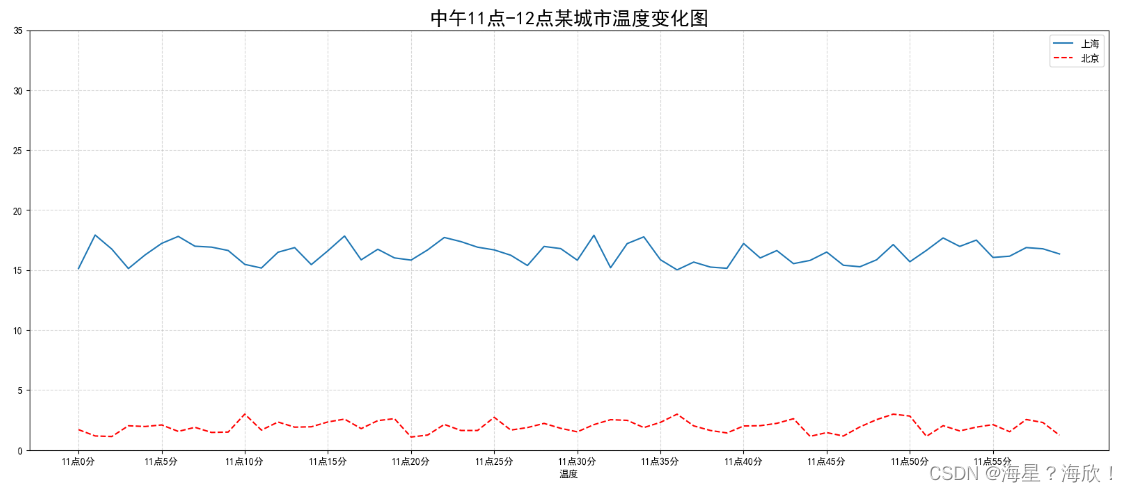
#0,准备数据 x = range(60) y_shanghai = [random.uniform(15,18) for i in x] y_beijing = [random.uniform(1,3) for i in x] #1,创建画布 plt.figure(figsize = (20,8),dpi = 100) #2,绘制图形 plt.plot(x,y_shanghai,label = '上海') plt.plot(x,y_beijing,color = 'r',linestyle = '--',label = '北京' ) #2.1 添加x,y刻度 #设置x,y轴刻度 x_ticks_label = ['11点{}分'.format(i) for i in x] y_ticks_label = range(40) #修改x,y轴坐标刻度显示 # plt.xticks(x_ticks_label[::5])#报错 #坐标轴不能直接通过字符串进行更改 plt.xticks(x[::5],x_ticks_label[::5]) plt.yticks(y_ticks_label[::5]) #2.2 添加网格显示 plt.grid(True,linestyle = '--',alpha=0.5)#alpha是透明度 #2.3 添加描述信息 plt.xlabel('时间') plt.xlabel('温度') plt.title('中午11点-12点某城市温度变化图',fontsize=20) #fontsize控制字体大小 #2.4图像保存--在show之前保存 plt.savefig('./test.png') #保存在当前目录下 #2.5 显示图例---加个label再legend plt.legend(loc = 'best') #3,图像显示 plt.show()- 1
- 2
- 3
- 4
- 5
- 6
- 7
- 8
- 9
- 10
- 11
- 12
- 13
- 14
- 15
- 16
- 17
- 18
- 19
- 20
- 21
- 22
- 23
- 24
- 25
- 26
- 27
- 28
- 29
- 30
- 31
- 32
- 33
- 34
- 35
- 36
- 37
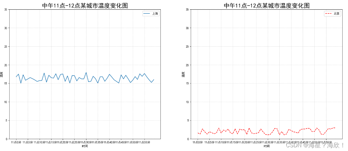
上面是多条放在一个画布内,下面3 多个坐标系实现绘图
#0,准备数据 x = range(60) y_shanghai = [random.uniform(15,18) for i in x] y_beijing = [random.uniform(1,3) for i in x] #1,创建画布 #plt.figure(figsize = (20,8),dpi = 100) fig,axes = plt.subplots(nrows=1,ncols=2,figsize=(20,8),dpi=100) #2,绘制图形 # plt.plot(x,y_shanghai,label = '上海') # plt.plot(x,y_beijing,color = 'r',linestyle = '--',label = '北京' ) axes[0].plot(x,y_shanghai,label = '上海') axes[1].plot(x,y_beijing,color = 'r',linestyle = '--',label = '北京' ) # #2.1 添加x,y刻度 # #设置x,y轴刻度 x_ticks_label = ['11点{}分'.format(i) for i in x] y_ticks_label = range(40) # #修改x,y轴坐标刻度显示 # # plt.xticks(x_ticks_label[::5])#报错 # #坐标轴不能直接通过字符串进行更改 # plt.xticks(x[::5],x_ticks_label[::5]) # plt.yticks(y_ticks_label[::5]) axes[0].set_xticks(x[::5]) axes[0].set_yticks(y_ticks_label[::5]) axes[0].set_xticklabels(x_ticks_label[::5]) axes[1].set_xticks(x[::5]) axes[1].set_yticks(y_ticks_label[::5]) axes[1].set_xticklabels(x_ticks_label[::5]) # #2.2 添加网格显示 # plt.grid(True,linestyle = '--',alpha=0.5)#alpha是透明度 axes[0].grid(True,linestyle = '--',alpha=0.5) axes[1].grid(True,linestyle = '--',alpha=0.5) # #2.3 添加描述信息 # plt.xlabel('时间') # plt.ylabel('温度') # plt.title('中午11点-12点某城市温度变化图',fontsize=20) #fontsize控制字体大小 axes[0].set_xlabel('时间') axes[0].set_ylabel('温度') axes[0].set_title('中午11点-12点某城市温度变化图',fontsize=20) #fontsize控制字体大小 axes[1].set_xlabel('时间') axes[1].set_ylabel('温度') axes[1].set_title('中午11点-12点某城市温度变化图',fontsize=20) # #2.4图像保存--在show之前保存 # plt.savefig('./test.png') #保存在当前目录下 plt.savefig('./test.png') #一样 # #2.5 显示图例---加个label再legend # plt.legend(loc = 'best') axes[0].legend(loc = 0) axes[1].legend(loc = 0) #3,图像显示 plt.show()- 1
- 2
- 3
- 4
- 5
- 6
- 7
- 8
- 9
- 10
- 11
- 12
- 13
- 14
- 15
- 16
- 17
- 18
- 19
- 20
- 21
- 22
- 23
- 24
- 25
- 26
- 27
- 28
- 29
- 30
- 31
- 32
- 33
- 34
- 35
- 36
- 37
- 38
- 39
- 40
- 41
- 42
- 43
- 44
- 45
- 46
- 47
- 48
- 49
- 50
- 51
- 52
- 53
- 54
- 55
- 56
4 折线图应用举例sin图
#制作sin图 import numpy as np #0,准备数据 x = np.linspace(-10,10,1000) y = np.sin(x) #1,创建画布 plt.figure(figsize=(20,8),dpi = 100) #2,绘制函数图像 plt.plot(x,y) #2.1添加网格显示 plt.grid() #3,显示图像 plt.show()- 1
- 2
- 3
- 4
- 5
- 6
- 7
- 8
- 9
- 10
- 11
- 12
- 13
- 14
- 15
- 16

5 其他图像绘制
import matplotlib.pyplot as plt import random ####让图像正常显示中文的代码 from pylab import mpl #设置显示中文字体 mpl.rcParams['font.sans-serif'] = ['SimHei'] #设置正常显示符合 mpl.rcParams['axes.unicode_minus'] = False- 1
- 2
- 3
- 4
- 5
- 6
- 7
- 8
- 9
5.1 散点图
0,准备数据 x = [225,98,247,457] y = [196.43,210.34,247,89] #1,创建画布 plt.figure(figsize=(20,8),dpi = 100) #2,绘制图像 plt.scatter(x,y) #3,图像显示 plt.show()- 1
- 2
- 3
- 4
- 5
- 6
- 7
- 8
- 9

5.2 柱状图
#0,准备数据 #电影名字 movie_name = ['雷神3','正义联盟','寻梦环游记','全球风暴','其他'] #横坐标 x = range(len(movie_name)) #票房数据 y = [125,98,147,157,99] #1,创建画布 plt.figure(figsize=(20,8),dpi = 100) #2,绘制图像 plt.bar(x,y,color=['b','r','g','y','c'],width=0.7) #改颜色和宽度 #2.1修改x轴显示 plt.xticks(x,movie_name) #2.2 添加网格 plt.grid(linestyle='--',alpha=0.8) #2.3添加标题 plt.title('电影票房收入') #3,图像显示 plt.show()- 1
- 2
- 3
- 4
- 5
- 6
- 7
- 8
- 9
- 10
- 11
- 12
- 13
- 14
- 15
- 16
- 17
- 18
- 19
- 20
5.3 饼图
x = [1,2,3,4,5] labels = ['class1','class2','class3','class4','class5'] xx = [0,0,0.1,0,0] plt.figure(figsize = (10,8),dpi = 100) plt.pie(x,labels = labels,autopct = '%.2f%%',explode = xx) #autopct显示百分比占比,explode显示突出 plt.show()- 1
- 2
- 3
- 4
- 5
- 6

- 一级缩进
-
相关阅读:
深入理解Spring四大元注解DIRT
分层架构理论基础
【Pytorch 】Dataset 和Dataloader制作数据集
YOLOv2-yolo9000-batter,faster,stronger 论文精度
Helm 基础入门 Helm介绍与安装
React-4 组件知识
web前端-javascript-标识符(说明,命名规则、不以数字关键字保留字开头、驼峰命名,补充)
SpringBoot SpringBoot 开发实用篇 5 整合第三方技术 5.22 RabbitMQ 安装
华为路由器MPLS VPN综合实验
dell 720 服务器错误代码提示
- 原文地址:https://blog.csdn.net/Sun123234/article/details/127560614
