-
【前端】Vue+Element UI案例:通用后台管理系统-Echarts图表:折线图、柱状图、饼状图
参考视频: VUE项目,VUE项目实战,vue后台管理系统,前端面试,前端面试项目上一篇:【前端】Vue+Element UI案例:通用后台管理系统-Echarts图表准备:axios封装、mock数据模拟实战
目标

- 左边:把代码中写死的数据改成mock模拟的数据
- 右边三个图:折线图,柱状图,饼状图
代码
数据改写为动态
上一篇中我们在mockData中有一个tableData,就是它了!

export default { data() { return { TableData:[], TableLabel, CountData } }, mounted(){ getData().then((data)=>{ console.log(data); this.TableData=data.data.getStatisticalData.data.tableData }) } }- 1
- 2
- 3
- 4
- 5
- 6
- 7
- 8
- 9
- 10
- 11
- 12
- 13
- 14
- 15
效果:

Echarts引入与html结构
文档:echarts文档
安装:
npm i echarts@5.1.2- 1
引入:
import * as echarts from 'echarts'- 1
html结构:
- 三个图标都是卡片,所以都在
el-card里 - 用ref引入echarts图表,且里面一定要有height或width,否则不显示
- 注意向左的间距
- 柱状图和饼状图的横向排列:
flex+space between
<div style="margin-left:20px"> <el-card style="height:280px"> <div ref="echarts1" style="height:280px">div> el-card> <div class="graph"> <el-card style="height:260px"> <div ref="echarts2" style="height:260px">div> el-card> <el-card style="height:260px"> <div ref="echarts3" style="height:260px">div> el-card> div> div>- 1
- 2
- 3
- 4
- 5
- 6
- 7
- 8
- 9
- 10
- 11
- 12
- 13
- 14
- 15
- 16
- 17
css:
.graph { display: flex; // 两个靠边 justify-content: space-between; margin-top: 20px; .el-card { width: 49%; } }- 1
- 2
- 3
- 4
- 5
- 6
- 7
- 8
- 9
- 10
效果:就是这样~

折线图:orderData
文档中模板的代码如下:虽然模板的代码是柱状图,而我们这里要做的事折线图,但我们可以通过模板来了解配置与其对应的效果。
// 基于准备好的dom,初始化echarts实例 var myChart = echarts.init(document.getElementById('main')); // 指定图表的配置项和数据 var option = { title: { text: 'ECharts 入门示例' }, tooltip: {}, legend: { data: ['销量'] }, xAxis: { data: ['衬衫', '羊毛衫', '雪纺衫', '裤子', '高跟鞋', '袜子'] }, yAxis: {}, series: [ { name: '销量', type: 'bar', data: [5, 20, 36, 10, 10, 20] } ] }; // 使用刚指定的配置项和数据显示图表。 myChart.setOption(option);- 1
- 2
- 3
- 4
- 5
- 6
- 7
- 8
- 9
- 10
- 11
- 12
- 13
- 14
- 15
- 16
- 17
- 18
- 19
- 20
- 21
- 22
- 23
- 24
- 25
- 26
- 27
效果如下 :
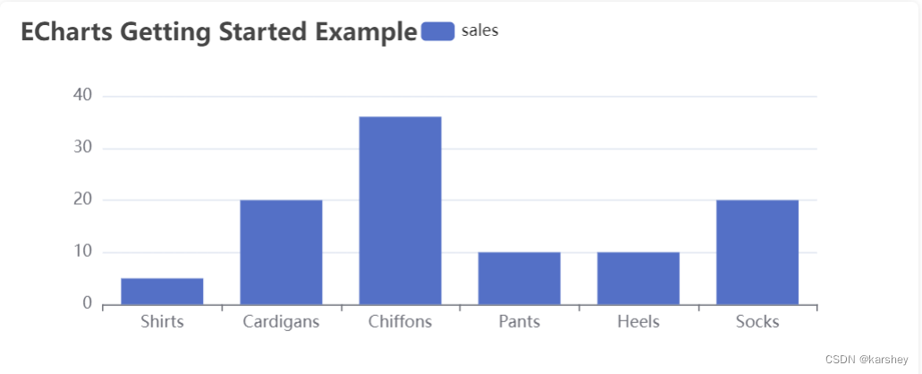
配置关系如下:具体可以看文档。

而series对应的是鼠标悬浮在柱上时的显示:

接下来写折线图。
观察一下数据:红框内的是x轴,也就是xAxis,series.name,1013这样的每一个数据都是series.data。

已经配置好的属性:
const order = { legend: { // 图例文字颜色 textStyle: { color: "#333", }, }, grid: { left: "20%", }, // 提示框 tooltip: { trigger: "axis", }, xAxis: { type: "category", // 类目轴 data: [], axisLine: { lineStyle: { color: "#17b3a3", }, }, axisLabel: { interval: 0, color: "#333", }, }, yAxis: [ { type: "value", axisLine: { lineStyle: { color: "#17b3a3", }, }, }, ], color: ["#2ec7c9", "#b6a2de", "#5ab1ef", "#ffb980", "#d87a80", "#8d98b3"], series: [], } export default order- 1
- 2
- 3
- 4
- 5
- 6
- 7
- 8
- 9
- 10
- 11
- 12
- 13
- 14
- 15
- 16
- 17
- 18
- 19
- 20
- 21
- 22
- 23
- 24
- 25
- 26
- 27
- 28
- 29
- 30
- 31
- 32
- 33
- 34
- 35
- 36
- 37
- 38
- 39
- 40
- 41
- 42
我们这里必须配置(自己配置)的属性有:
legend、xAxis、yAxis、series。mounted() { getData().then((data) => { console.log(data); this.TableData = data.data.getStatisticalData.data.tableData // echarts图表 // 折线图 // 基于准备好的dom,初始化echarts实例 const echarts1 = echarts.init(this.$refs.echarts1) var echarts1Option = {} // ES6解构语法 var { orderData, userData, videoData } = data.data.getStatisticalData.data // 获取x轴:要求是一个对象 const xAxis = Object.keys(orderData.data[0]) const xAxisData = { data: xAxis } // 配置 echarts1Option.legend = xAxisData echarts1Option.xAxis = xAxisData echarts1Option.yAxis = {} echarts1Option.series = [] // 配置series xAxis.forEach(key => { echarts1Option.series.push({ name: key, type: 'line', // key对应的orderData的所有值 data: orderData.data.map(item => item[key]) }) }) // 使用刚指定的配置项和数据显示图表。 echarts1.setOption(echarts1Option); }) }- 1
- 2
- 3
- 4
- 5
- 6
- 7
- 8
- 9
- 10
- 11
- 12
- 13
- 14
- 15
- 16
- 17
- 18
- 19
- 20
- 21
- 22
- 23
- 24
- 25
- 26
- 27
- 28
- 29
- 30
- 31
- 32
- 33
- 34
- 35
- 36
- 37
- 38
- 39
- 40
- 41
效果:

柱状图:userData
接下来的操作就很类似了。
基础代码:
// 柱状图 const echarts2 = echarts.init(this.$refs.echarts2) var echarts2Option = user echarts2.setOption(echarts2Option);- 1
- 2
- 3
- 4
已经配置好的属性:
const user = { legend: { // 图例文字颜色 textStyle: { color: "#333", }, }, grid: { left: "20%", }, // 提示框 tooltip: { trigger: "axis", }, xAxis: { type: "category", // 类目轴 data: [], axisLine: { lineStyle: { color: "#17b3a3", }, }, axisLabel: { interval: 0, color: "#333", }, }, yAxis: [ { type: "value", axisLine: { lineStyle: { color: "#17b3a3", }, }, }, ], color: ["#2ec7c9", "#b6a2de"], series: [], } export default user- 1
- 2
- 3
- 4
- 5
- 6
- 7
- 8
- 9
- 10
- 11
- 12
- 13
- 14
- 15
- 16
- 17
- 18
- 19
- 20
- 21
- 22
- 23
- 24
- 25
- 26
- 27
- 28
- 29
- 30
- 31
- 32
- 33
- 34
- 35
- 36
- 37
- 38
- 39
- 40
- 41
- 42
user缺什么,我们这里就配置什么:
xAxis.data、series.显然
xAxis.data是date的value:series会有两个,分别是new和active。

// 柱状图 const echarts2 = echarts.init(this.$refs.echarts2) var echarts2Option = user // 配置 echarts2Option.xAxis.data = userData.map(item => item.date) echarts2Option.series = [ { name: '新增用户', data: userData.map(item => item.new), // 类型:bar是柱状图 type:'bar' } , { name: '活跃用户', data: userData.map(item => item.active), type:'bar' } ] echarts2.setOption(echarts2Option);- 1
- 2
- 3
- 4
- 5
- 6
- 7
- 8
- 9
- 10
- 11
- 12
- 13
- 14
- 15
- 16
- 17
- 18
- 19
- 20
- 21
- 22
效果:

饼状图:videoData
配置:
const video = { tooltip: { trigger: "item", }, color: [ "#0f78f4", "#dd536b", "#9462e5", "#a6a6a6", "#e1bb22", "#39c362", "#3ed1cf", ], series: [], } export default video- 1
- 2
- 3
- 4
- 5
- 6
- 7
- 8
- 9
- 10
- 11
- 12
- 13
- 14
- 15
- 16
- 17
我们只需要自己配
series。// 饼状图 const echarts3 = echarts.init(this.$refs.echarts3) var echarts3Option = video echarts3Option.series = { data: videoData, type: 'pie' } echarts3.setOption(echarts3Option);- 1
- 2
- 3
- 4
- 5
- 6
- 7
- 8
效果:

总效果
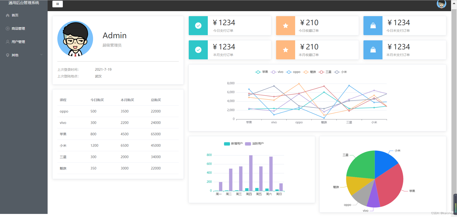
总代码:Home.vue
本篇新建的文件和文件夹如红框所示,代码已放在文中。
有更改的问价如橙框所示,代码如下。

<template> <el-row> <el-col :span="8"> <el-card> <div class="user"> <img src="../assets/images/user.png" alt=""> <div class="userInfo"> <p div class="name">Adminp> <p div class="access">超级管理员p> div> div> <div class="loginInfo"> <p>上次登录时间:<span>2021-7-19span>p> <p>上次登陆地点:<span>武汉span>p> div> el-card> <el-card style="margin-top: 20px;"> <el-table :data="TableData" style="width: 100%"> <el-table-column v-for="(value, key) in TableLabel" :prop="key" :label="value"> el-table-column> el-table> el-card> el-col> <el-col :span="16"> <div class="num"> <el-card v-for="item in CountData" :key="item.name" :body-style="{ display: 'flex', padding: 0 }"> <i class="icon" :class="`el-icon-${item.icon}`" :style="{ backgroundColor: item.color }">i> <div class="details"> <p class="price">{{ priceFormate(item.value) }}p> <p class="desc">{{ item.name }}p> div> el-card> div> <div style="margin-left:20px"> <el-card style="height:280px"> <div ref="echarts1" style="height:280px">div> el-card> <div class="graph"> <el-card style="height:280px"> <div ref="echarts2" style="height:280px">div> el-card> <el-card style="height:320px"> <div ref="echarts3" style="height:320px">div> el-card> div> div> el-col> el-row> template> <script> import TableLabel from '../data/TableLabel' import CountData from '../data/CountData' import { getData } from '../api/index' import * as echarts from 'echarts' // echarts的配置数据 import order from '../data/echartsData/order' import user from '../data/echartsData/user' import video from '../data/echartsData/video' export default { data() { return { TableData: [], TableLabel, CountData } }, methods: { priceFormate(price) { return "¥" + price } }, mounted() { getData().then((data) => { console.log(data); this.TableData = data.data.getStatisticalData.data.tableData // echarts图表 // 折线图 // 基于准备好的dom,初始化echarts实例 const echarts1 = echarts.init(this.$refs.echarts1) var echarts1Option = order // ES6解构语法 var { orderData, userData, videoData } = data.data.getStatisticalData.data // 获取x轴:要求是一个对象 const xAxis = Object.keys(orderData.data[0]) const xAxisData = { data: xAxis } // 配置 echarts1Option.legend = xAxisData echarts1Option.xAxis = xAxisData echarts1Option.yAxis = {} echarts1Option.series = [] // 配置series xAxis.forEach(key => { echarts1Option.series.push({ name: key, type: 'line', // key对应的orderData的所有值 data: orderData.data.map(item => item[key]) }) }) // 使用刚指定的配置项和数据显示图表。 echarts1.setOption(echarts1Option); // 柱状图 const echarts2 = echarts.init(this.$refs.echarts2) var echarts2Option = user // 配置 echarts2Option.xAxis.data = userData.map(item => item.date) echarts2Option.series = [ { name: '新增用户', data: userData.map(item => item.new), // 类型:bar是柱状图 type: 'bar' } , { name: '活跃用户', data: userData.map(item => item.active), type: 'bar' } ] echarts2.setOption(echarts2Option); // 饼状图 const echarts3 = echarts.init(this.$refs.echarts3) var echarts3Option = video echarts3Option.series = { data: videoData, type: 'pie' } echarts3.setOption(echarts3Option); }) } } script> <style lang="less" scoped> .user { // 垂直居中 display: flex; align-items: center; // 外边距:分割线距离loginInfo的距离 margin-bottom: 20px; // 内边距:分割线距离User的距离 padding-bottom: 20px; border-bottom: 1px solid #ccc; img { width: 150px; height: 150px; border-radius: 50%; margin-right: 40px; } .userInfo { .name { font-size: 32px; margin-bottom: 10px; } .access { color: #999999; } } } .loginInfo { p { line-height: 28px; font-size: 14px; color: #999999; span { color: #666666; margin-left: 60px; } } } .num { display: flex; // 要换行 flex-wrap: wrap; // 从头到尾均匀排列 justify-content: space-between; margin-left: 20px; .el-card { width: 32%; margin-bottom: 20px; .icon { width: 80px; height: 80px; line-height: 80px; text-align: center; font-size: 30px; color: #fff; } .details { // 竖着排且居中 display: flex; flex-direction: column; justify-content: center; margin-left: 15px; .price { font-size: 30px; margin-bottom: 10px; line-height: 30px; height: 30px; } .desc { font-size: 14px; color: #999; text-align: center; } } } } .graph { display: flex; // 两个靠边 justify-content: space-between; margin-top: 20px; .el-card { width: 49%; } } style>- 1
- 2
- 3
- 4
- 5
- 6
- 7
- 8
- 9
- 10
- 11
- 12
- 13
- 14
- 15
- 16
- 17
- 18
- 19
- 20
- 21
- 22
- 23
- 24
- 25
- 26
- 27
- 28
- 29
- 30
- 31
- 32
- 33
- 34
- 35
- 36
- 37
- 38
- 39
- 40
- 41
- 42
- 43
- 44
- 45
- 46
- 47
- 48
- 49
- 50
- 51
- 52
- 53
- 54
- 55
- 56
- 57
- 58
- 59
- 60
- 61
- 62
- 63
- 64
- 65
- 66
- 67
- 68
- 69
- 70
- 71
- 72
- 73
- 74
- 75
- 76
- 77
- 78
- 79
- 80
- 81
- 82
- 83
- 84
- 85
- 86
- 87
- 88
- 89
- 90
- 91
- 92
- 93
- 94
- 95
- 96
- 97
- 98
- 99
- 100
- 101
- 102
- 103
- 104
- 105
- 106
- 107
- 108
- 109
- 110
- 111
- 112
- 113
- 114
- 115
- 116
- 117
- 118
- 119
- 120
- 121
- 122
- 123
- 124
- 125
- 126
- 127
- 128
- 129
- 130
- 131
- 132
- 133
- 134
- 135
- 136
- 137
- 138
- 139
- 140
- 141
- 142
- 143
- 144
- 145
- 146
- 147
- 148
- 149
- 150
- 151
- 152
- 153
- 154
- 155
- 156
- 157
- 158
- 159
- 160
- 161
- 162
- 163
- 164
- 165
- 166
- 167
- 168
- 169
- 170
- 171
- 172
- 173
- 174
- 175
- 176
- 177
- 178
- 179
- 180
- 181
- 182
- 183
- 184
- 185
- 186
- 187
- 188
- 189
- 190
- 191
- 192
- 193
- 194
- 195
- 196
- 197
- 198
- 199
- 200
- 201
- 202
- 203
- 204
- 205
- 206
- 207
- 208
- 209
- 210
- 211
- 212
- 213
- 214
- 215
- 216
- 217
- 218
- 219
- 220
- 221
- 222
- 223
- 224
- 225
- 226
- 227
- 228
- 229
- 230
- 231
- 232
- 233
- 234
- 235
- 236
- 237
- 238
- 239
- 240
- 241
- 242
- 243
- 244
- 245
- 246
- 247
- 248
- 249
- 250
- 251
- 252
- 253
- 254
- 255
- 256
- 257
-
相关阅读:
C语言数组越界和内存分布
UE5——动画重定向
Upgrade to Grafana v11.0-preview
两个有序表的合并(三种方法)
Python程序笔记2023004
Docker、Jenkins、Harbor 构建镜像部署 SpringBoot 项目
开放式耳机哪个好、百元开放式耳机推荐品牌
【畅购商城】详情页详情之商品详情
【Excel】如何画不同时序交叉的百分比堆积柱状图
【设计模式】组合模式
- 原文地址:https://blog.csdn.net/karshey/article/details/127737979
